Editing Grid Layout
You can use Drag-and-Drop to add new components from the component palette or to move and resize components already laid out on the work form.
A component may be dragged...
A component may be dropped...
 | It's possible to drag and drop individual components and event component sub-trees between different widgets, each of them being edited in a separate instance of Widget editor. |
1. Dropping on an Empty Cell
When a component is dragged onto the work form and the mouse hovers over an empty cell (one marked with a white background, if decorations are enabled), the cell is highlighted in blue:
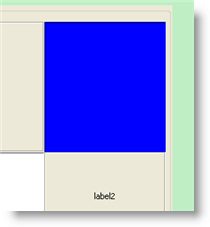
Dropped here, the component will occupy the empty cell.
2. Dropping Over an Existing Component
You can drag an existing component from its location on the form and drop it onto another component. This will allow to replicate properties from the dragged component to a dropped one. This obviously doesn't work with new components dragged from the palette.
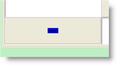
2 and 3. Dropping Into Special Locations
The third and fourth aforementioned methods work similarly. The component being dragged is dropped inside a cell already occupied by some component, but not directly over the component. Each cell occupied by some component (label1 in the following picture) has 16 available drop locations:
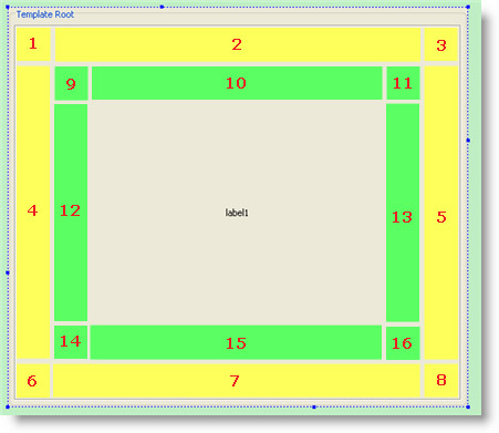
Dropping the component over one of the first eight locations (illustrated in yellow in the example above) puts it into a new row and/or column of the layout grid. More on this in the description for method 3, below.
Dropping the component over locations 9-16 (green, above), creates a new Panel container in the cell occupied by label1. This panel will now hold two components: label1 and the component that was dropped. More on this below, in the description of method 4.
3. Dropping on Locations 1-8
If the component is dropped on the locations 1-8 (shown in the image above), it will be put in the layout grid of label1's container (the root panel, in our example). A new row and/or column will be created in the layout grid to hold the dropped component. When the mouse hovers over the 1-8 drop locations, "ghost" frames are shown to help visualize where the new row and/or column will be located. Here is what it looks like when the mouse is held over location 5:
If we now drop the new component, a new column will be created to the right of label1:
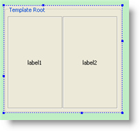
Hovering over location 8 shows the following "ghost" frames:
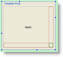
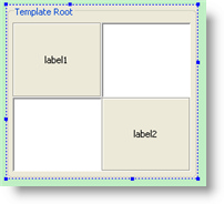
In the above case, the new component will be placed on a new row and column created to the bottom and to the right of label1. As a side-effect, two empty cells will be created:
This is what the "ghost" frames look like in a more complicated layout:
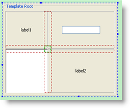
This is what this layout looks like once the component is dropped:
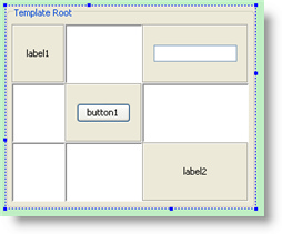
4. Dropping on Locations 9-16
Dropping on these locations creates new a Panel in the cell. This panel will then contain two components: label1 and the component dropped. Their relative positions in the new panel will depend on where the new component is dropped. "Ghost" frames are also shown when the mouse hovers over these locations while dragging. Here is the "ghost" frame for location 13:
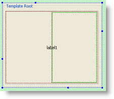
If the component is dropped on this location, a new panel will be created, containing two cells in one row:
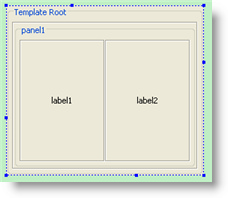
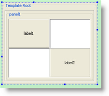
For location 16, "ghost" frames show that the new panel will contain four cells. label1 will be placed in row 1, column 1, while the dropped component will be placed in row 2, column 2:
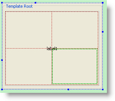
Here is what the new panel will look like:
Resizing COMPONENTS and Editing THEIR Margins
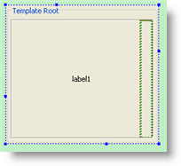
When a component is selected in the work form, it has a blue dashed border with blue and green dots used to resize it or edit its Grid Layout margins:
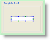
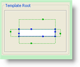
To resize the component, drag the blue dots. To change its margins, drag the green dots. When margins are set to non-zero values, they are drawn as green dashed rectangles around the component:
 | Holding Shift key during component resize will cause it to preserve its proportions. Holding Alt key during resize will resize component relatively to its center instead of its top-left point. |
 | The Root panel never has margins (it must occupy all available space in the widget window. |
Was this page helpful?