Panels Markup
Panels component group, also known as Containers, aggregates a special type of web components that act as a container with a configured layout for other UI building blocks. Each Panel supports the same set of layouts to choose from and has its unique take on the way the nested components are organized and shown on the dashboard.
Markup Structure
Although being more containers/layouts by themselves, Panels comply with general principles of web components structure with some caveats. A Panel always has the Container Part, while the Element Part is just a <div> wrapper with CSS properties that depend on the selected panel layout type.

The wrapper holding the Layout property settings is considered the panel's Root, similar to the Root Panel of a dashboard.
Key property defining the markup features of a given Panel is its layout type:
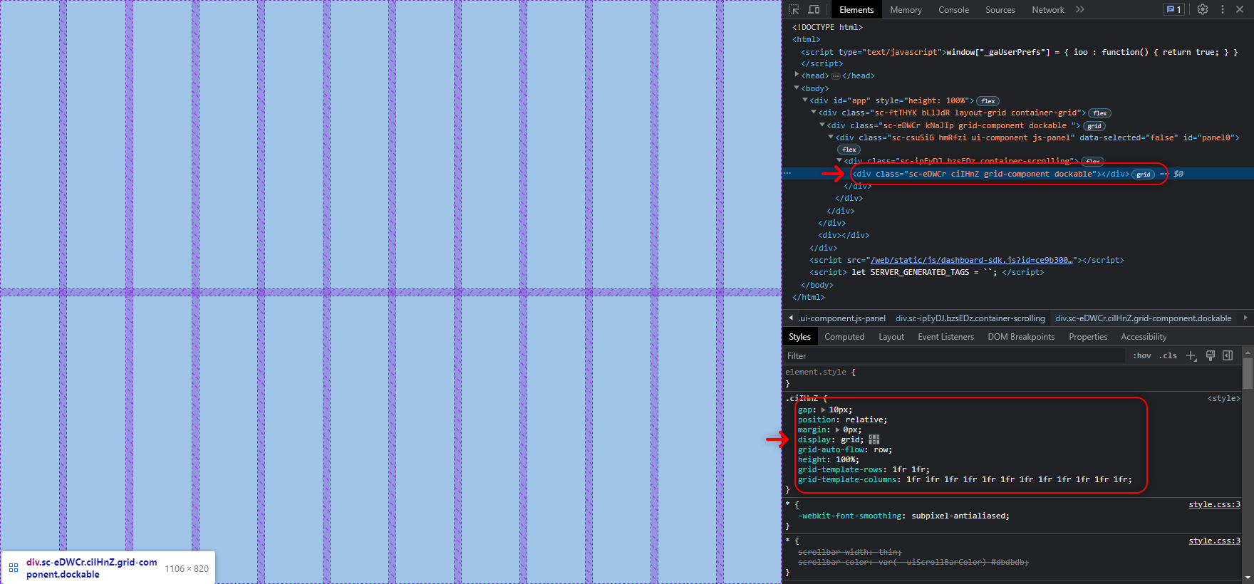
Grid panels’ Element settings represent native CSS Grid layout configuration and their Root is, in fact, the layout. Look for the
grid-componentHTML class attribute to spot it in a dashboard markupAbsolute panels are marked with the
absolute-componentclass and are straight up blank wrappers without any meaningful properties by defaultAll nested components are rendered according to their Container Properties right inside Grid and Absolute panels’ Roots with no additional HTML medium in between
Dockable panels start from a
<div>with thedockable-componentclass and generate a good number of wrappers inside them even if empty. You can define their styles in the Element Style property group of the panel.
Effects of Layout on Nested Components’ Markup
A Panel can enrich its nested components’ Container part with additional HTML wrappers and attributes depending on which Layout property values it has:
For Grid layout, the influence is minimal. Components located on this type of layout are rendered in the HTML flow with the default set of wrappers and no attributes added. The position-related Container Properties or the components translate into
grid-areaCSS property, defining their position on the gridA Panel with Absolute layout forces the nested components to have the
position: absoluteCSS property relative to the panel’s Root. The position-related Container Properties of the components translate into theleftandtopCSS properties, anchoring them to a specific point on the layoutDockable panel adds new attributes to the existing wrappers of components’ Container, adds/replaces some classes and creates two more
<div>elements in between the wrappers:
<div id="{componentID}" data-tab-id="dock-{componentID}" role="tabpanel" class="dockable-layout dock-tabpane dock-tabpane-{state}" aria-labelledby="rc-tabs-<n>-tab-{componentID}">
    <div class="dock-pane-cache">
        <div class="... ... dock-layout-item">
<div class="... ... container-scrolling"> | Note that in the Dockable layout classes of the outermost |
Was this page helpful?