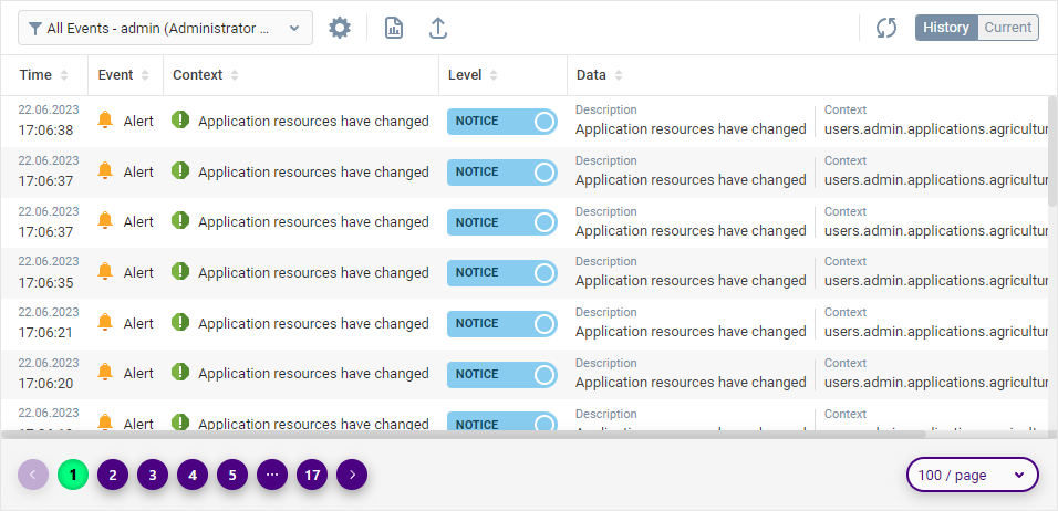
Pagination
A pagination is a component’s element that provides navigation through paged content of the component.
A pagination element mainly occurs in the components of the Data Display component group that are meant to visualize and manage various types of table data.
The amount of data entries in a component should exceed its Items per Page property value in order for a pagination to appear.
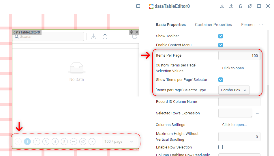
A pagination consists of a group of buttons responsible for switching between content pages and, if the component’s Show ‘Items per Page’ Selector property is on, it also has the said selector.
 | The exact set of buttons available in a pagination varies depending on which pagination page a user currently is. |
Pagination Markup
Pagination elements are rendered inside the component’s Container, within a <div> element located on the same level as the component’s content.
The general markup is the same for any component using pagination:
<div class="... ... custom-pagination">
  <ul class="ant-pagination ... ..." unselectable="unselectable">
    <li title="Previous Page" class="ant-pagination-prev ant-pagination-disabled" aria-disabled="true">
      <div class="... ... pagination-prev-button">
        {BUTTON SVG CONTENT}
      </div>
    </li>
    <li title="1" class="ant-pagination-item ant-pagination-item-1 ant-pagination-item-active" tabindex="0">
      <div class="... ... pagination-item">1</div>
    </li>
    ...
    <li title="Next Page" tabindex="0" class="ant-pagination-next" aria-disabled="false">
      <div class="... ... pagination-next-button">
        {BUTTON SVG CONTENT}
      </div>
    </li>
  </ul>
  <div class="... ... max-row-number">
    <div class="ant-select agg-select default pagination-size-select ant-select-single ant-select-show-arrow">
      {DROPDOWN LIST CONTENT}
  </div>
</div> | In this HTML code sample, the first page of paginated content is selected, so the Previous Page button is disabled and the 1 (first page button) has the |
The main wrapper always contains a <ul class="custom-pagination"> element, inside which the navigation buttons are located. The Items per Page selector is present within the next <div class="max-row-number"> element, if the corresponding component property is enabled.
| Use browser’s developer tools to figure out what attributes the content of both pagination sections have, if you’re targeting something specific there. |
Changing Pagination Style
Pagination doesn't have a dedicated custom CSS style property in the component Properties Editor. Working with its customization is supposed from the Container Style property of the component, like so:
.custom-pagination {
  height: auto;
  padding: 16px;
  background-color: #F5F5F5;
  box-shadow: 0 0 16px 0 rgba(0,0,0,0.2);
  z-index:1;
}

.custom-pagination li {
  height: 28px;
  width: 28px;
}

.custom-pagination li #icon {
  fill: white;
}

.custom-pagination li > div {
  width: 100%;
  background-color: indigo;
  border-radius: 50%;
  border: none;
  color: white;
  font-weight: 600;
  box-shadow: 0 4px 12px 0 rgba(0,0,0,0.4);
}

.custom-pagination .ant-pagination-item-active > div {
  background-color: springgreen;
  box-shadow: inset 0 0 4px 2px rgba(0,0,0,0.2);
  color: black;
  font-weight: 800;
}

.custom-pagination .pagination-size-select {
  border-radius: 24px;
  border: solid 2px indigo;
  box-shadow: 0 4px 12px 0 rgba(0,0,0,0.2);
  color: indigo;
}

.custom-pagination .pagination-size-select #icon {
  fill: indigo;
}
 | To learn more about adding custom CSS to components in the UI Builder, visit the Applying CSS to Components section. |
Was this page helpful?