Polar Chart
A polar chart displays (X, Y) data items using polar coordinates. |
|
The polar chart is based on standard Plot and standard Renderer. It inherits all their properties.
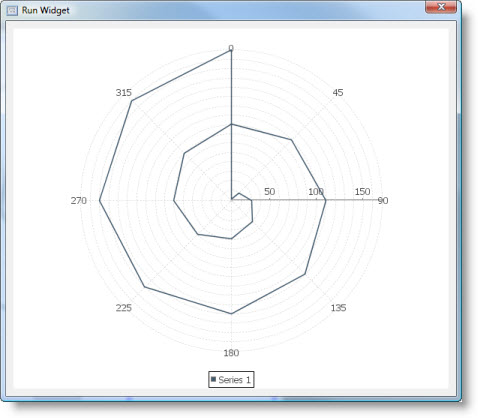
This is what polar chart looks like:

Dataset
The category line chart supports Custom Data model only.
It has the following Source Data Bindings:
Binding | Expected Value Type | Description |
Series | String | Textual name of the data series. Data series is represented by a single-color line on the chart. |
Theta | Number | Data item angle in degrees. |
Radius | Number | Data item radius (distance from plot center) for the above series/angle. |
Common Properties
Width, Height, Bindings, Visible, Opaque, Background, Border
Source Data and Source Data Bindings properties.
All properties of a Plot.
All properties of a Renderer.
Custom Properties
Axis
Value axis that provides the value scale for the plot. The axis will extend from the center of the plot towards the right hand side of the chart.
Property name: axis
Property type: Data Table
Common Events
Hidden, Shown, Moved, Resized, Mouse Clicked, Mouse Pressed, Mouse Released, Mouse Entered, Mouse Exited, Mouse Moved, Mouse Wheel Moved, Key Typed, Key Pressed, Key Released, Focus Gained, Focus Lost
All relevant chart events.
Angle Gridlines
The "angle gridlines" are the optional lines radiating out from the center of the chart.
Angle Gridlines Visible
Flag that controls whether or not the angle gridlines are displayed.
Property name: angleGridlinesVisible
Property type: Boolean
Angle Tick Unit
Angle between two radial axes in degrees.
Tick unit that controls the spacing between the angular grid lines.
Property name: angleTickUnit
Property type: Float
Angle Gridline Stroke
Stroke used to display the angle gridlines.
Property name: angleGridlineStroke
Property type: Data Table
Angle Gridline Paint
Paint used to display the angle gridlines.
Property name: angleGridlinePaint
Property type: Data Table
Angle Labels Visible
Flag that controls whether or not the angle labels are visible.
Property name: angleLabelsVisible
Property type: Boolean
Angle Label Font
Font for the angle labels.
Property name: angleLabelFont
Property type: Data Table
Angle Label Paint
Paint for the angle labels.
Property name: angleLabelPaint
Property type: Data Table
Radius Gridlines
The "radius gridlines" are drawn as circles at a regular interval that is controlled by the size of the tick unit on the plot's axis.
Radius Gridlines Visible
Flag that controls whether or not the radius gridlines are visible.
Property name: radiusGridlinesVisible
Property type: Boolean
Radius Gridline Stroke
Stroke used to draw the radius gridlines.
Property name: radiusGridlineStroke
Property type: Data Table
Radius Gridline Paint
Paint used to draw the radius gridlines.
Property name: radiusGridlinePaint
Property type: Data Table
Corner Text Items
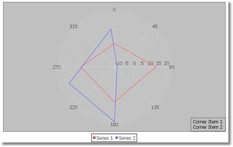
Plot provides an option to add one or more short text items (called "corner text items") to the lower right corner of the plot.
Corner Text Items
A list of text string to display in the lower right corner.
Property name: cornerTextItems
Property type: Data Table
Series Filled
The table defining whether or not each series is drawn as a "filled" polygon:
Property | Name | Type | Description |
Index | index | Integer | Series index. |
Series Filled | seriesFilled | Boolean | Flag indicating whether or not the area "inside" the series should be filled. |
Property name: seriesFilled
Property type: Data Table
Additional Examples
A polar chart with two data series:

Was this page helpful?
