Writing Styles to the Root Panel
Working with shared CSS styles via Root Panel’s custom CSS property is the recommended method to handle single-page and small applications. It also works well for applications of any complexity if a Dashboard Template is used to contain the UI.
The main difference between this approach and writing custom styles directly to dashboard components’ properties is that it requires using more specific selectors to compose the CSS rules targeting the components’ elements.
 | This approach is also used in the example of plugging a custom font to a dashboard in the Custom Fonts article. |
The most simple scenario is managing the style of several identical components on a single dashboard.
Let’s consider the typical situation with having several buttons of one style within a layout. We’re not going to get too real with the UI, so there will be one Button component on the dashboard’s Root Panel and a couple more nested inside a Simple Panel next to the first button.
In the UI Builder, add a Button to the dashboard by clicking on it in the Component Palette or by dragging it to the layout.
Add a Simple Panel to the dashboard the same way as you did with the Button.
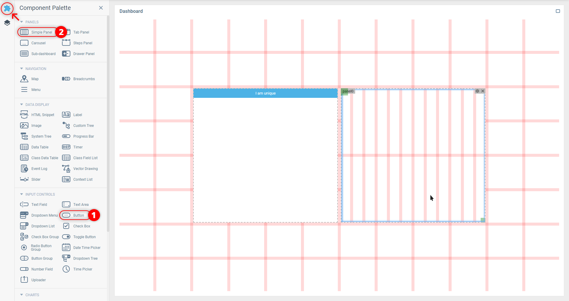
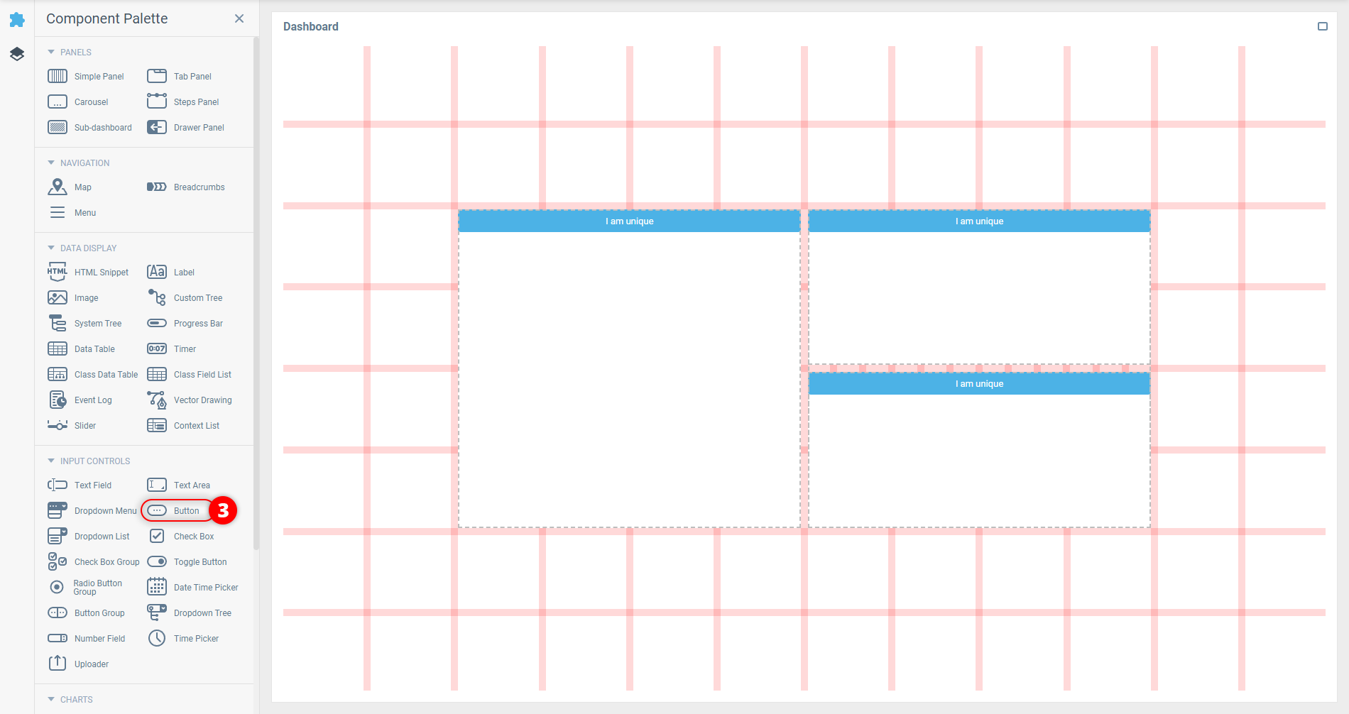
Add two more Buttons to the created Simple Panel the same way as you added the first two components.
 | You can add components to a nested panel in the UI Builder by clicking on them in the Component Palette if you select the panel first. |
Before heading to the Root properties to add shared styles for the buttons, it is better to figure out the optimal CSS selectors for the rule first. This will help to reach the right elements in the most efficient manner and don’t hit anything unrelated with the added rule.
 | Read the Useful Browser Tools and Using Selectors articles to get a better understanding of the described procedure. |
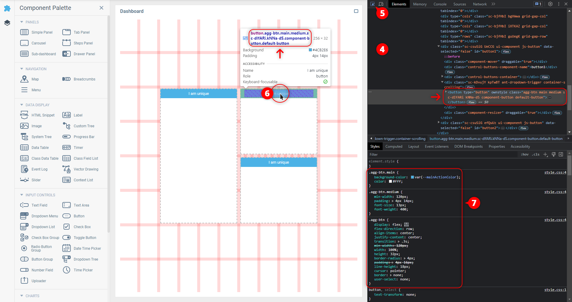
Open the browser’s developer tools by pressing F12 on Windows/Linux or Option + ⌘ + I on Mac. Alternatively, you can right-click on any place at the page and select the Inspect (or similar) option from the appeared context menu.
In the developer tools, enable the Inspector Tool available in the top-left corner of the opened window.
Hover over any added Button with the cursor and click on it to inspect its CSS properties. It’s a
<button>element with theclass="agg-btn main medium component-button default-button"attribute and a<span>element containing the button’s name inside it.Examine the Style properties of the selected button. The current element’s appearance mostly comes from three CSS rules using the
.agg-btn,.agg-btn.mainand.agg-btn.mediumselectors.
To find out what is responsible for the element style in the
hoverstate, force the state by opening the context menu with the right-click on the element in the document tree and choosing the state from the Force State (or similar) group.The rule with
.agg-btn.main:hoverselector appears in the Styles list.
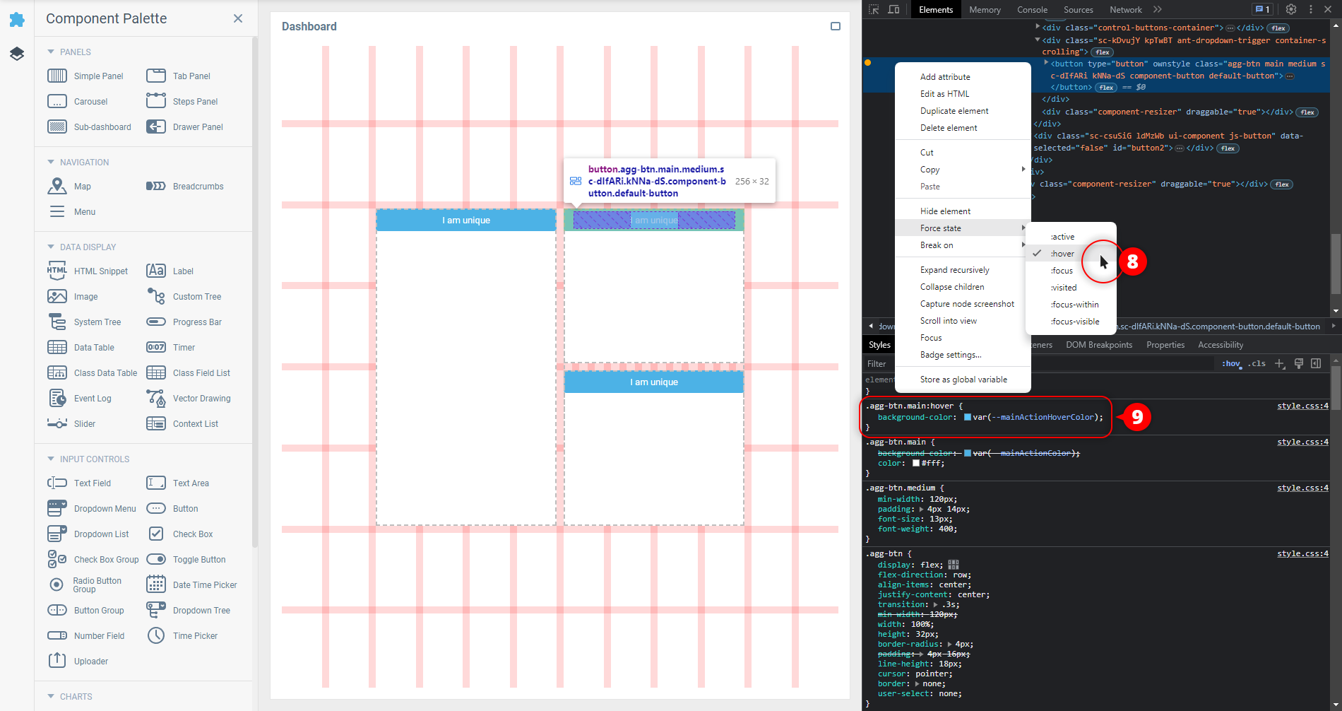
Looks like it is all the information needed, so now we can finally proceed to adding CSS rules to the Root Panel.
Open the dashboard’s Root Properties Editor by clicking on it in the Component Tree.
In the Properties Editor, switch to the Element Style tab.
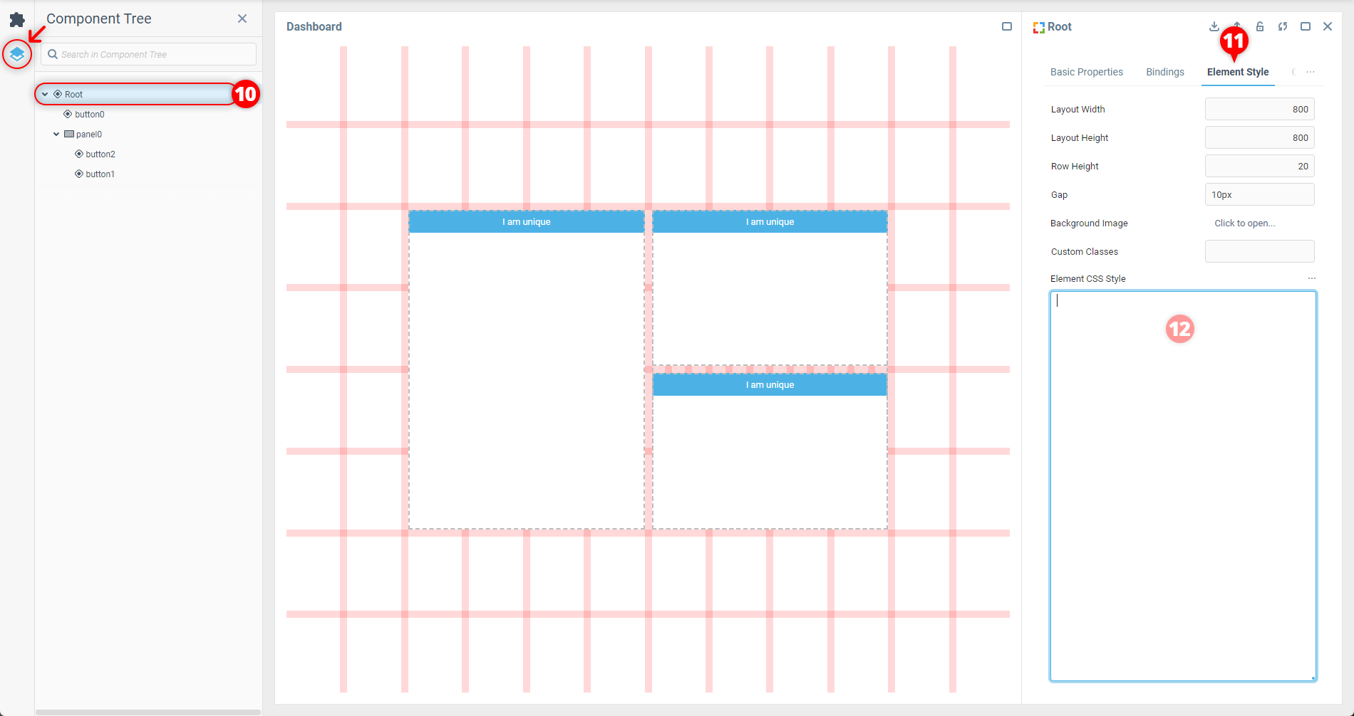
In the Element Style tab, add the CSS rules targeting the buttons and their
hoverstate to the Element CSS Style property. Use the classes from the both discovered rules responsible for the Button appearance in the selectors to narrow the custom CSS to only this type of buttons:
.agg-btn.main.medium {
  height: auto;
  margin: auto;
  padding: 20px 40px;
  font-size: 24px;
  font-weight: 500;
  letter-spacing: 0.25px;
  text-transform: uppercase;
  border-radius: 40px;
  background: radial-gradient(rgba(130,60,180,1) 0%, rgba(250,30,30,1) 70%, rgba(250,170,70,1) 100%);
  box-shadow: 0 6px 32px 0 rgba(20,0,30,0.4);
}

.agg-btn.main.medium:hover {
  transform: scale(0.9);
  box-shadow: 0 4px 28px 0 rgba(20,0,30,0.6);
} | If you are planning to apply more global styles to the Root Panel, use the CSS comments syntax ( |
The style is applied once the field is out of focus, and the result is visible on the dashboard.
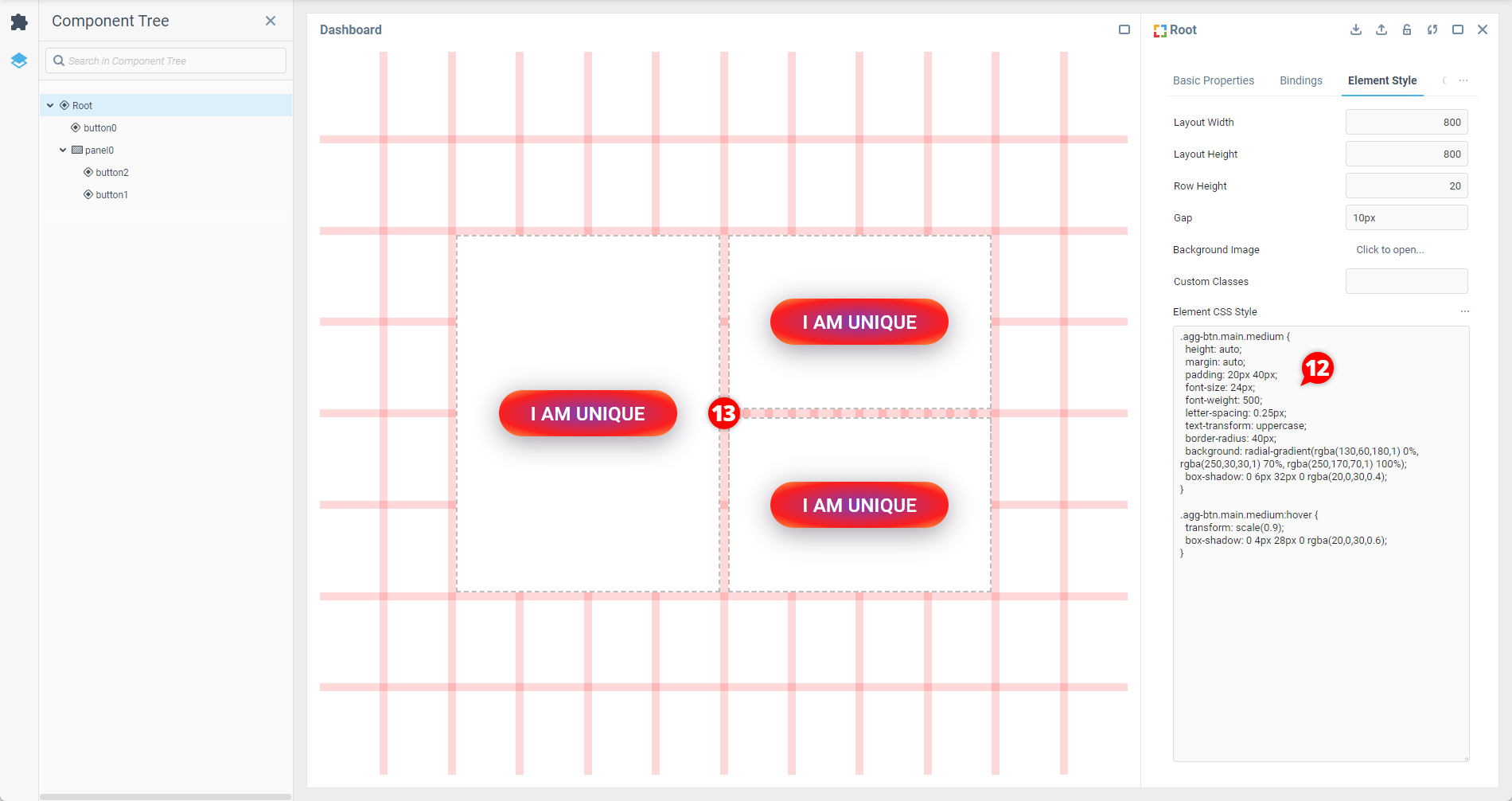
If you add another Button component from the Component Palette to the dashboard, you will see that it is also affected by the added custom styles.
 | You can add shared styles using this method not only to the Root Panel of the dashboard, but to the Element CSS Style property of nested panels too. Use this to localize style adjustments within a subset of components affected by global styles added to the Root Panel or other panels higher in the layout’s hierarchy. |
The course of action in this scenario isn’t particularly different from the single dashboard one, but involves using a Dashboard Template to open the application’s dashboards.
Once you’ve configured the template, all the steps are the same as in the example for one dashboard, but this time the shared styles are written in the template’s Root instead of root panels of the dashboards containing the components you want to style.
Was this page helpful?