Creating Dashboards
The first step will be to create blank Dashboard contexts in the Iotellect system. In a similar way to creating other contexts, choose the Create option from the Dashboard context menu in the system tree.
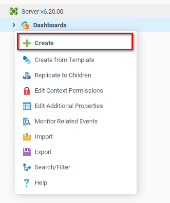
As with other new contexts, the Dashboard Properties window opens, requiring a few initial properties to be filled in before creating the context. We want to create three new dashboards, and each will have similar properties.
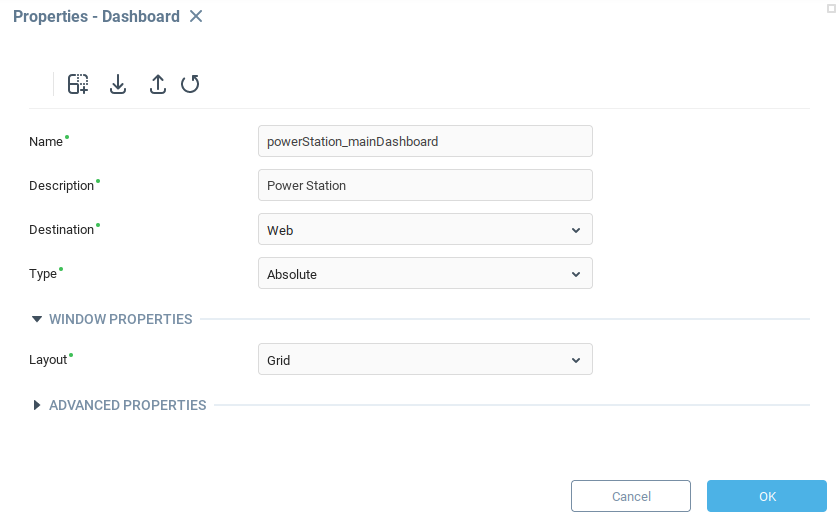
Name - As with other contexts, the name determines the context path of the new dashboard. Create dashboards with the following names:
powerStation_mainDashboardproductionSummary_subDashboardplantOverview_subDashboard
Description - The text displayed in the user interface when referencing the object, and we set them similar to the name.
Power StationProduction SummaryPlant Overview
Destination - We want these dashboards to be accessible via the Web UI, so all dashboards will have
Webfor the destination.Type - All of our dashboards will be created as
AbsolutedashboardsLayout - The following example will use the
Gridlayout to simplify
For example, the powerStation_mainDashboard Dashboard Properties looks like the following:
Once you’ve created the three dashboards, they should appear under the Dashboard node in the system tree.
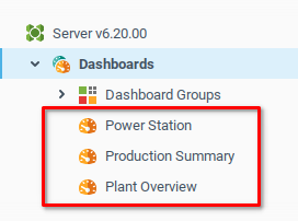
The Production Summary and Plant Overview dashboards will be displayed on a sub-dashboard in the Power Station Dashboard. We will add some placeholder text to the Production Summary and Plant Overview dashboards so we can differentiate which ones are being loaded into the sub-dashboard. Later, we can add other components.
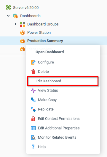
Open the context menu for the Production Summary dashboard and choose the Edit Dashboard option.
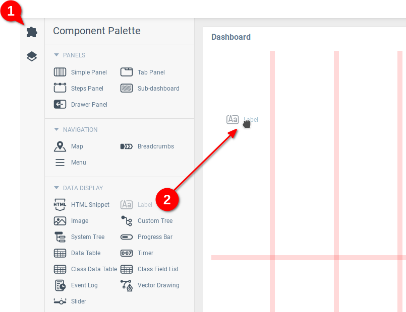
The Web UI builder opens with a blank grid, where dashboard components can be added. Open the Component Palette (1) and drag and drop a Label component to one of the grid cells (2).
Drag the lower right corner of the label component to use the whole width of the dashboard (1), open the label’s Properties Editor (2), and enter Production Summary for the label text (3).

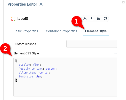
Previewing the dashboard shows that the text is very small and left justified. To make the placeholder text a little more visually appealing, open the Element Style tab of the label properties editor (1) and add some CSS styling to the element (2).
Use the following CSS to make the font larger and center-justify the text.
{
  display: flex;
  justify-content: center;
  align-items: center;
  font-size: 5em;
}
Previewing or opening the Dashboard should display something like the following:

Repeat the above steps for the Plant Overview dashboard to produce a similar result.

Adding Dashboards to Source Control
If you are using source control, you might want to add the new dashboards to your application. A dashboard is a context and it is added to the application in the same way as any other context. You can add each individual dashboard to the application resource list according to its context path. The dashboards created in the previous steps have the following context paths:
users.admin.dashboards.powerStation_mainDashboardusers.admin.dashboards.productionSummary_subDashboardusers.admin.dashboards.plantOverview_subDashboard
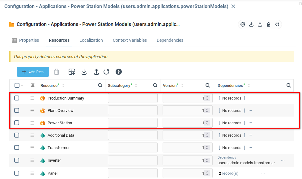
From the Application Configuration window, you should see the new dashboards reflected in the list of resources.
Now that you have created a few dashboards, we will examine how to connect them into a coherent application. Recalling the Dashboard Breakdown from user interface development, where we developed a simple architecture for the dashboards, we will now develop the dashboard that will contain the sidebar navigation menu and a sub-dashboard to display the various elements of the dashboard.
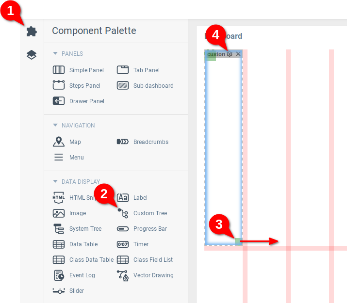
Open the Power Station dashboard for editing. Open the Component Palette (1) and click on the Custom Tree component (2) to add the component to the dashboard. Resize the component so it takes up two cells (3) and click the gear icon (4) to open the Properties Editor for the component.
To add items to the menu in the Custom Tree, open the Tree Data property in the Properties Editor.
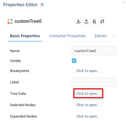
The variable Tree Data allows you to define any number of nodes of the tree. There are a number of fields in this variable, which we will examine later. For now, you only need to add data to the Key and Title fields to create some menu items.
The Key field is the unique identifier for each node in the custom tree, and it’s provided when certain events are triggered by the component. The nodes are items in the side menu, and each of them corresponds to a dashboard.
The Title field determines the text which will be displayed in the user interface.
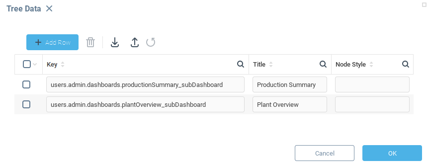
Recall from previous steps that you created two other dashboards, Production Summary and Plant Overview and extracted their respective context paths users.admin.dashboards.productionSummary_subDashboard and users.admin.dashboards.plantOverview_subDashboard.
Create entries into the Tree Data list for each dashboard, using the dashboard context path as the Key and an appropriate description in the Title. Click OK to save and close.
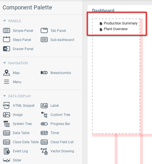
You should now see two new nodes in the Custom Tree component.
The underlying part of the menu is complete, next you’ll add a sub-dashboard component and learn how to modify its behavior based on user inputs to the sidebar menu.
Adding the Sub-Dashboard Component
Return to the Component Pallet and add a Sub-dashboard component (1) to the dashboard, resizing it to cover the majority of the grid space (2). Finally, select the References property (3) to open the Select Context window.
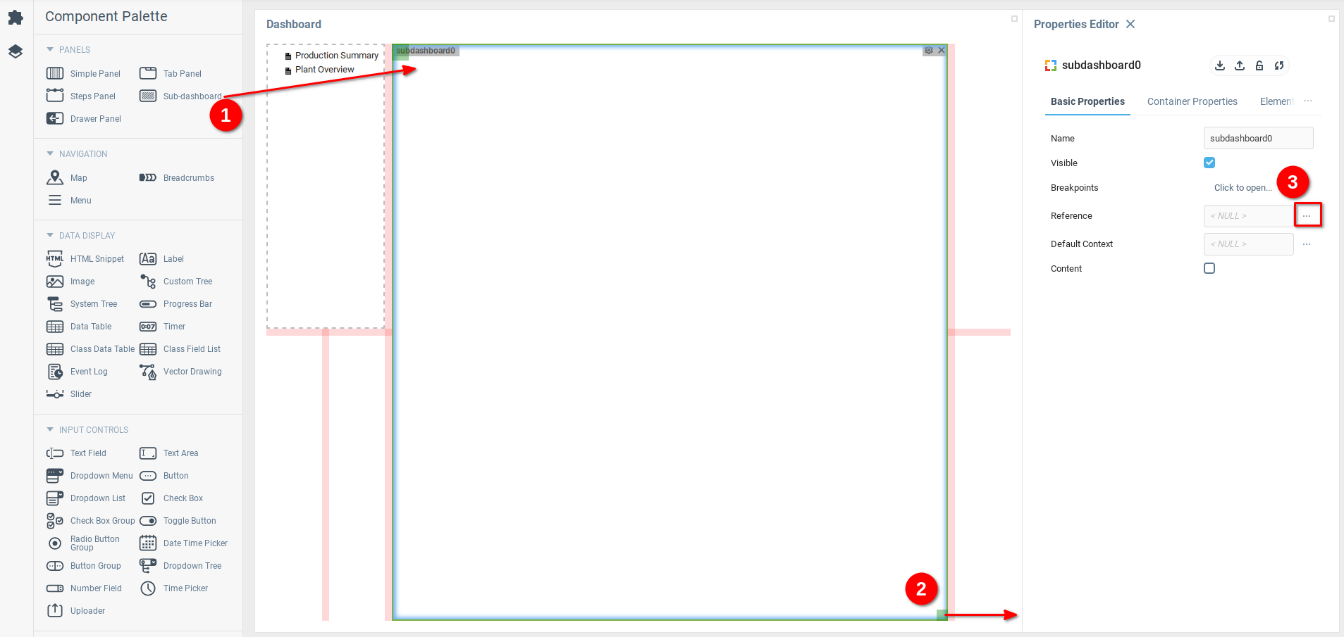
From the Select Context window, navigate through the context tree to find the Production Summary dashboard under the admin dashboards. Click OK to save and close. This action sets the Production Summary dashboard as the default to be displayed by the sub-dashboard. The workspace should display a preview of the components you’ve added, as well as showing the Production Summary dashboard in the sub-dashboard component by default.

Now that the components are configured, the next step is to configure the sidebar menu to navigate between dashboards.
Using Bindings to Change Component Values
Throughout Iotellect, data bindings are used to facilitate a wide range of interactions between different contexts. The following section will demonstrate how to use dashboard bindings to configure the sidebar menu to allow users to navigate between dashboards.
The abstract idea is to have each item in the sidebar menu associated with a dashboard. When the user clicks a menu item, the corresponding dashboard will be displayed in the sub-dashboard area.
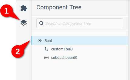
Open the Component Tree (1) to show a list of the current dashboard components. Click the Root icon (2) to open the Properties Editor for the Root component.
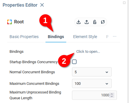
On the Root Properties Editor, open the Bindings tab (1) and from there open the Bindings property (2) to open the Bindings data table.
The Bindings table contains fields to define a Target for data, an Expression to prepare the data, and an Activator to determine which events will cause the binding to activate. Add a row to the table (1) then open the Select Target menu (2).

Target
The Target is the variable, field, function, action or event that will be modified or called when the binding is activated. In order to change which dashboard is being displayed by the sub-dashboard component, the binding needs to modify the Reference property of the sub-dashboard.
To target this property, in the Select Target window, select the Properties item from the side menu (1) and open the subdashboard0 menu item (2) to expose its list of properties. Select Reference from the list (3) and click OK to save and close.
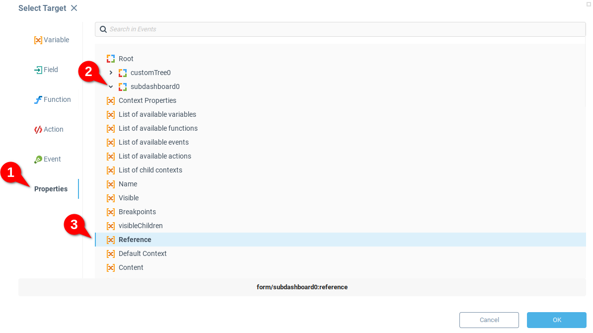
You will notice that the value form/subdashboard0:reference has been placed in the Target field. Rather than using the Select Target menu, you can directly enter target references with the syntax form/<component name>:<component property name>
Activator
Now that there is a target for the binding, choose an activator. There are several different ways to activate a binding. On startup, based on a certain event, or periodically. In this case, you want the binding to be activated when a user clicks an item in the sidebar menu. Set the checkbox for On Event to True (1) to indicate that the binding should fire for an event. Then open the Select Activator window by clicking on the icon under the Activator field (2).

From the Select Activator window, select the Component Events (1) and unfurl the customTree0 component (2) to choose the Node Selection event. Click OK to save and close.
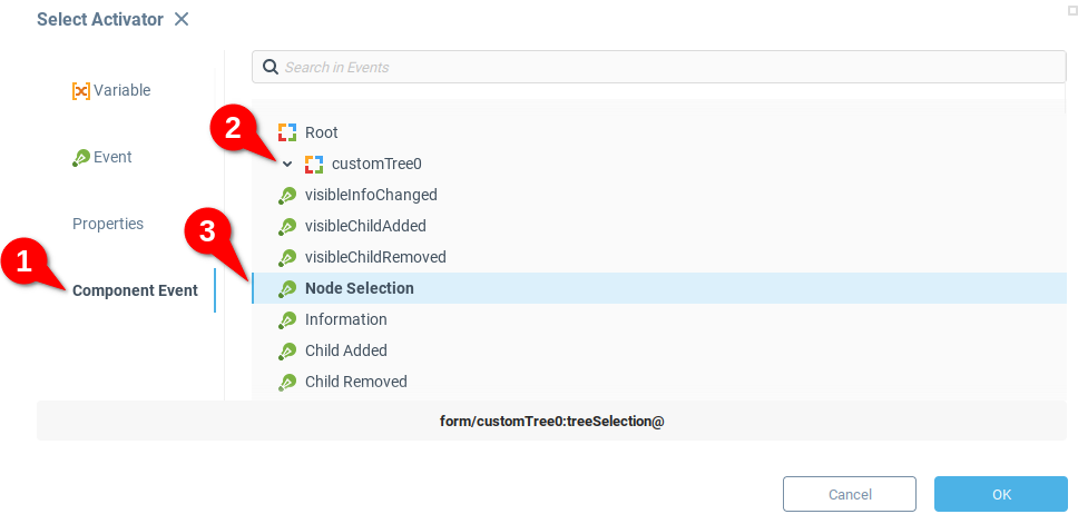
You will see that the Activator field is now populated with the text form/customTree0:treeSelection@. Similar to the Target field, you can construct input for the Activator field based on the syntax form/<component name>:<component event name>@ when you want to trigger bindings with a dashboard component event.
To complete the binding, we will need to send the appropriate data to the Reference property of the sub-dashboard component.
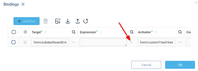
The Expression field is evaluated when the binding is activated, and Iotellect attempts to place the resulting data in the Target field. Open the Expression Builder window by clicking on the indicated icon under the Expression field.
In the documentation for the Custom Tree component, you see that the Node Selection event is triggered when the user selects a node in the tree, and generates a data table with a single field key with the key value of the selected node. For example, when the user clicks on the node Production Summary the event generates following data table:
key |
|---|
|
In order to use this data, you will write an expression to extract the node value from the data table and provide a string which will be provided to the sub-dashboard component. This expression will have two parts:
{env/value}is an environment reference specific to the Web UI bindings for retrieving Activator Event data. When a Web UI binding is triggered by an event, this references points to the data generated by the event.cell(DataTable table [, String field [, Integer row [, Boolean description]]])is a Data Table Processing function which allows you to extract a specific cell from a data table.
The cell() function requires the following arguments:
DataTable table - The table to be processed, in this case you will use the
{env/value}reference to get the table generated by the activation event Node Selection.String field - A string indicating the field name. From the Custom Tree component documentation, you know the table has a single field
key.Integer row - Which row from the specified field to extract, with indexing starting at
0. The Node Selection event only produces one row, so this value will be0.
Putting the designated arguments into the function yields:
cell( {env/value} , "key", 0 )
Which you can put into the Expression Builder then click OK to save and close.
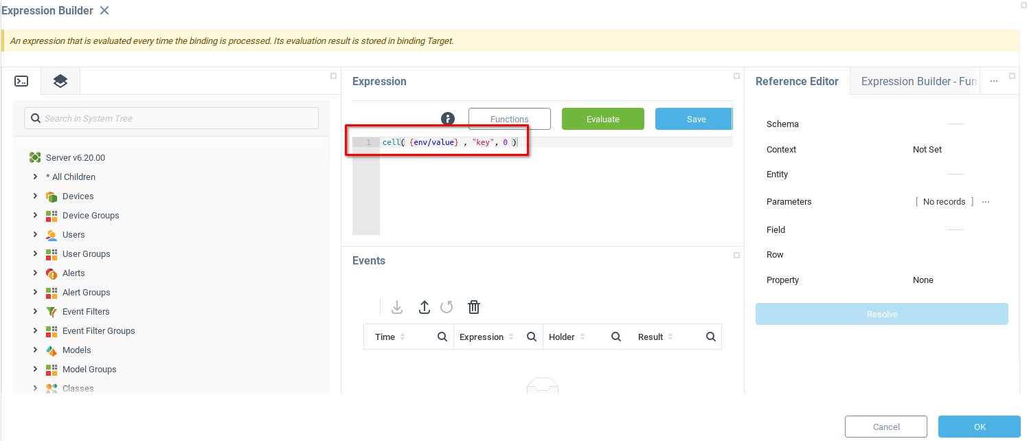
You have defined a binding which activates every time a user clicks on a node in the Custom Tree component, and sends the key value of the node to the Sub-Dashboard component. Click OK to save and close.

As long as the key values for each item of the custom tree corresponds to the Context Path of a dashboard, the user can navigate between dashboards using the nodes of the custom tree. Test it out for yourself by opening the dashboard preview

Click on the tree nodes to make sure the correct dashboards are displayed. Your dashboard should work something like this:

The mechanics of the dashboard are working, but the menu seems to be lacking a bit of style and there is no data in our dashboards. Next we will examine how to add data from one of our devices, and then consider styling dashboard components using custom CSS.
Was this page helpful?