Container Part of a Component
Container part envelops the functional part of a component, separating it from the layout it is placed in. Its main purposes are:
to maintain position-related properties of the component on any type of dashboard layout separately from its appearance;
to define the outer size and the look of the area containing the component;
to be a persistent common part of every web component for the development needs.
Container Structure
The Container structure is almost always the same for any component, the only thing that differs is some of the attribute values.

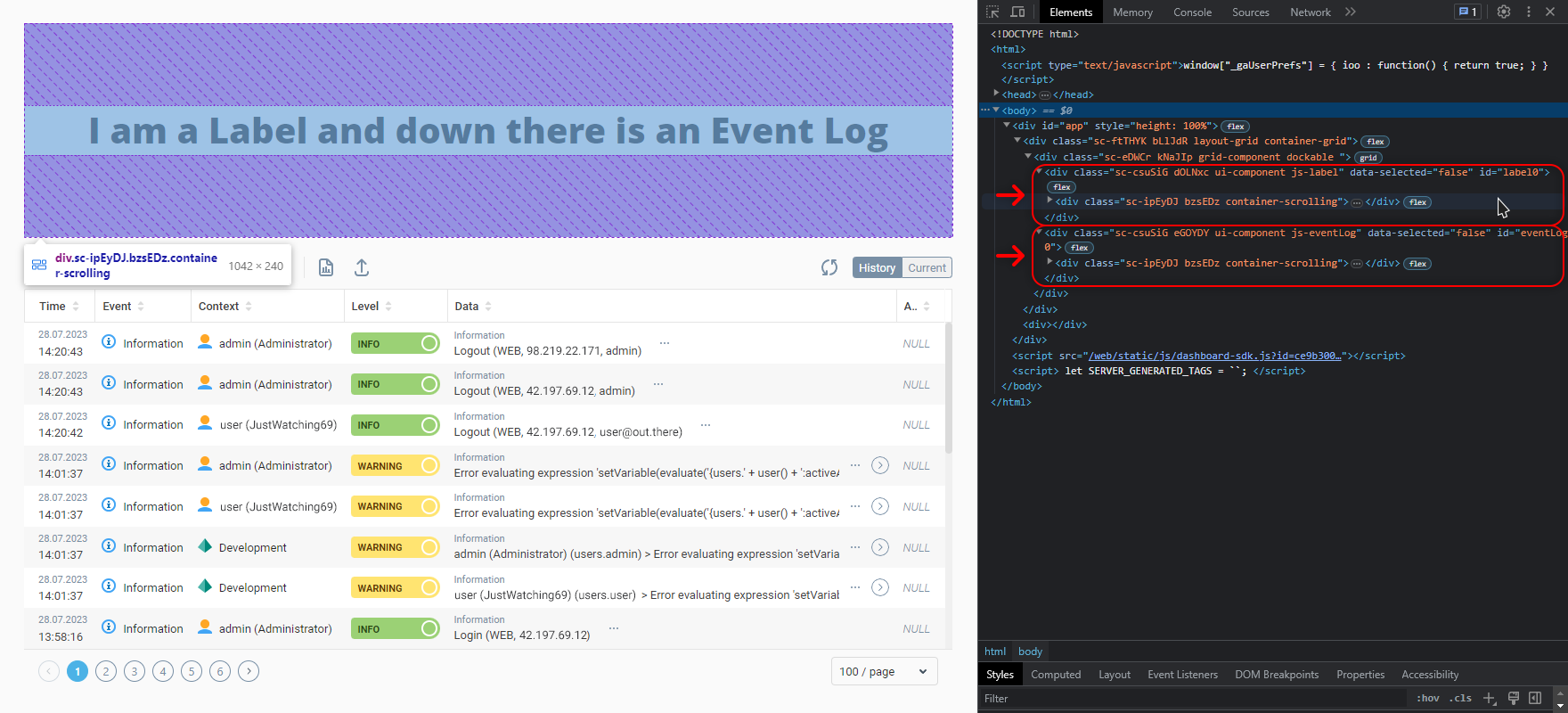
Each component on the dashboard starts from a number of nested <div> containers with a defined set of attributes:
<div class="... ... ui-component js-{componentName}" id="{componentID}">
	...
<div class="... ... container-scrolling">The outermost and the innermost <div> elements are essential and present in each component. Between them may be additional elements depending on the component's features or the layout a component is placed in.
 | Note that in the dashboard EDIT mode there are additional HTML wrappers and classes present in the Container part that you won’t find in a running dashboard. |
Key things to know:
Styles written in the Container Style property apply to the first wrapper by default
First two classes of the HTML elements here are dynamically generated gibberish like
sc-hhOBVtoriIsGzIyou should ignoreThe outermost wrapper keeps information about a component’s position on the layout, which is configured in the Container Properties properties tab of the component Properties Editor
It is the only element in a component that has a human-friendly
IDattribute in it, and the ID equals the component’s Name property value assigned in the UI BuilderA
js-{componentName}class contains the dynamic part with the name of the component written in camel case (e.g.js-systemTree)The
<div>with thecontainer-scrollingclass is responsible for maintaining the Content Overflow property of the Container Properties.
 | There may be changes in classes, attributes and the number of wrappers depending on the layout the component is currently placed in. Read more about that in the Panels Markup article. |
Was this page helpful?