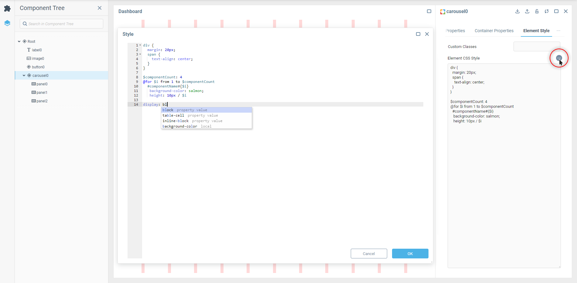
CSS Editor
Embedded CSS Editor is a type of Text Editor that is specifically configured to help with writing CSS. It is available as the editor in component properties intended for getting CSS code as their value.
The CSS Editor is available by clicking the right-most (

The editor supports all the key features you would expect from a decent code editing tool, such as code auto-completion, syntax highlighting and keyboard shortcuts. The styles are applied in real time once added.
Syntax Features
There are two key moments specific to the CSS Editor in component properties:
No selector needed if you want to apply styles directly to the “main” HTML element of the component part that the property group is responsible for. That means that you can write styles without using the
selector {}part. It’s convenient for styling simple components like Label or Timer.Selectors written in component style properties don't require you to take into account dashboard’s DOM outside of the component. The count starts from the outermost HTML element of the component itself.
 | Keep the last listed feature in mind when using selectors in custom CSS rules within components’ properties. It could be the reason why the custom styles don’t apply despite a selector being correct from the classic HTML/CSS standpoint. |
SCSS Support
SCSS (short for Sassy CSS) is a syntax for SASS preprocessor scripting language that is interpreted or compiled into CSS. If you are experienced in web component styles so much that you don’t really want to return to native CSS anymore — we’ve got you covered here too.
 | CSS preprocessors are basically add-ons for CSS that enable more efficient code writing thanks to the support of advanced syntax rules. |
For example, you can nest styles related to special cases within the general rule:
div {
  margin: 20px;
  span {
    text-align: center;
  }
}This notation will result in the following compiled CSS:
div {
  margin: 20px;
}

div span {
  text-align: right;
}Or you can create loops to apply different styles to elements with similar classes or IDs:
$componentCount: 4
@for $i from 1 to $componentCount
  #componentName#{$i}
   background-color: salmon;
height: 10px / $iThis notation will result in the following compiled CSS:
#componentName1 {
  background-color: salmon;
  height: 10px;
}

#componentName2 {
  background-color: salmon;
  height: 20px;
}

#componentName3 {
  background-color: salmon;
  height: 30px;
} | You can mix the SCSS syntax and regular CSS notations with plain CSS properties allowed by the CSS Editor within a custom style property however you want. |
Was this page helpful?