Range Slider
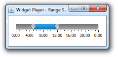
A component that allows the user to select numerical or date range by sliding knobs within a bounded interval. The slider can show both major tick marks and minor tick marks between them. The number of values between tick marks is controlled by Major Tick Spacing and Minor Tick Spacing properties. |
|
This is what a slider looks like:

Common Properties
Width, Height, Bindings, Enabled, Visible, Foreground, Background, Opaque, Border, Font, Cursor, Tooltip, Focusable, Popup Menu
Custom Properties
Orientation
Orientation of the slider: Horizontal or Vertical.
Property name: orientation
Property type: Integer
Paint Track
Determines whether the track is painted on the slider.
Property name: paintTrack
Property type: Boolean
Paint Ticks
Determines whether tick marks are painted on the slider.
Property name: paintTicks
Property type: Boolean
Paint Labels
Determines whether labels are painted on the slider.
Property name: paintLabels
Property type: Boolean
Range Visible
Determines whether the range is visible.
Property name: rangeVisible
Property type: Boolean
Range Selection
Enables the range selection ability.
Property name: rangeSelectionEnabled
Property type: Boolean
Slider Shape
Shape of the slider: Round, Square, Rectangular, Drop or None.
Property name: thumbShape
Property type: String
Slider Design
Design of the slider: Bright, Dark, Stainless or Dark Stainless.
Property name: thumbDesign
Property type: String
Track Width
Determines the width of the track: Thin, Medium or Thick.
Property name: thumbDesign
Property type: String
Dark Track
Allows to enable dark background for the range.
Property name: darkTrack
Property type: Boolean
Range Color
Determines the color of the range.
Property name: rangeColor
Property type: Color
Custom Labels
Table that contains custom labels for the slider. Each label is characterized by slider value at that it is painted and label description.
Property name: customLabels
Property type: Data Table
Range Type
Determines the type of the range: Numerical Range or Date Range.
Property name: rangeType
Property type: Integer
Minimum
Minimum value of the slider.
Property name: minimum
Property type: Integer
Maximum
Maximum value of the slider.
Property name: maximum
Property type: Integer
Minor Tick Spacing
This is the distance, measured in values, between each minor tick mark. If you have a slider with a range from 0 to 50 and the minor tick spacing is set to 10, you will get minor ticks next to 0, 10, 20, 30, 40, and 50.
Property name: minorTickSpacing
Property type: Integer
Major Tick Spacing
This is the distance, measured in values, between each major tick mark. If you have a slider with a range from 0 to 50 and the major tick spacing is set to 10, you will get major ticks next to 0, 10, 20, 30, 40, and 50.
Property name: majorTickSpacing
Property type: Integer
Lower Value
Default lower value of the slider.
Property name: lowerValue
Property type: Integer
Upper Value
Default upper value of the slider.
Property name: upperValue
Property type: Integer
Minimum Date
Minimum date of the slider.
Property name: minimumDate
Property type: Date
MAXIMUM Date
Maximum date of the slider.
Property name: maximumDate
Property type: Date
Minor Tick Spacing
This is the time interval, between each minor tick mark.
Property name: minorDateTickSpacing
Property type: Long
Major Tick Spacing
This is the time interval, between each major tick mark.
Property name: majorDateTickSpacing
Property type: Long
Lower Date
Default value for the lower date of the slider.
Property name: lowerDate
Property type: Date
Upper Date
Default value for the upper date of the slider.
Property name: upperDate
Property type: Date
Live Changes
If this property is enabled, range value updates with every slider move. If disabled, updates occur when mouse is released only.
Property name: liveChanges
Property type: Boolean
Common Events
Hidden, Shown, Moved, Resized, Mouse Clicked, Mouse Pressed, Mouse Released, Mouse Entered, Mouse Exited, Mouse Moved, Mouse Wheel Moved, Key Typed, Key Pressed, Key Released, Focus Gained, Focus Lost
Was this page helpful?
