Category Bar Renderer
This renderer is a subtype of Category Renderer used in conjunction with a Category Plot to create bar charts. It inherits all Category Renderer's properties and has its own properties.
Controlling the Width of Bars
The renderer automatically calculates the width of the bars to fit the available space for the plot, so you cannot directly control how wide the bars are. However, the bar width is a function of the following properties:
Item Margin
Item margin as a percentage of the overall length of the category axis (the default is 0.20, or twenty percent). This controls the amount of space that is allocated to the gaps between bars within the same category.
Property name: itemMargin
Property type: Float
Maximum Bar Width
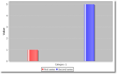
Maximum bar width as a percentage of the axis length. For example, setting this to 0.05 will ensure that the bars never exceed five percent of the length of the axis. This can improve the appearance of charts where there is a possibility that only one or two bars will be displayed.
Example of a chart with limited maximum bar width:

Property name: maximumBarWidth
Property type: Float
the Base Value
By default, the renderer draws a bar between zero (the base value) and the data value of the item to be displayed. Some specialized bar charts require a non-zero base value.
Base
Base value for the bars.
Property name: base
Property type: Float
Include Base in Range
Flag that controls whether or not the base value is included in the auto range calculation for the range axis.
Property name: includeBaseInRange
Property type: Boolean
Item Labels
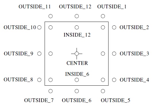
Due to the rectangular nature of the bars, the renderer calculates anchor points that are arranged as shown in figure below. Note that the numbers correspond (roughly) to the position of the hours on a clock face.

When an item label is displayed inside a bar, the renderer will calculate if the bar is large enough to contain the text. If not, the renderer will check to see if a "fallback" label position has been specified. If there is a fallback position, the label is displayed there, and if there is no fallback position the label is not displayed at all. Two fallback positions can be specified, one for positive values and one for negative values (this covers the standard case where positive value labels that don't fit within a bar should be displayed above the bar, and negative value labels that don't fit within a bar should be displayed below the bar).
Item Label Position Fallback
This property includes two values:
- Positive Item Label Position: fallback position for positive item labels. Set the value to null if you prefer labels to be hidden if they don't fit within the bar.
- Negative Item Label Position: fallback position for negative item labels. Set the value to null if you prefer labels to be hidden if they don't fit within the bar.
Property name: itemLabelPositionFallback
Property type: Data Table
Bar Shadows
Shadows Visible
Flag that controls whether or not shadows are drawn for the bars.
Property name: shadowsVisible
Property type: Boolean
Shadow Paint
Paint used to fill the bar shadows.
Property name: shadowPaint
Property type: Data Table
Shadow X Offset
X-offset for the bar shadows.
Property name: shadowXOffset
Property type: Float
Shadow Y Offset
Y-offset for the bar shadows.
Property name: shadowYOffset
Property type: Float
Other Properties
Bar Painter
Bar Painter takes care of the actual drawing of individual bars. It has the following properties:
Property | Name | Type | Description |
Type | type | Integer | Painter type: Standard or Gradient:
|
G1 | g1 | Float | The division point between the first and second gradient regions (greater than 0.0). |
G2 | g2 | Float | The division point between the second and third gradient regions (greater than G1). |
G3 | g3 | Float | The division point between the third and fourth gradient regions (greater than G2 and less than 1.0). |
Property name: barPainter
Property type: Data Table
Draw Bar Outline
Flag that controls whether or not an outline is drawn around each bar. The paint and stroke used for the bar outline are specified using properties of a base chart renderer.
Property name: drawBarOutline
Property type: Boolean
Minimum Bar Length
Sets the minimum length that will be used for a bar. You can set this to a small value (e.g. 1.0) to ensure that very short bars do not disappear.
Property name: minimumBarLength
Property type: Float
Was this page helpful?