Toolbars
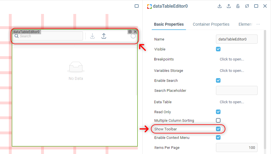
A toolbar is an area within a component that provides access to various tools and actions available in the component.
Toolbars occur in the components of the Data Display component group that are meant to visualize and manage various types of table data and have the Show Toolbar property on.

 | The exact set of items available in a component’s toolbar varies depending on the component and its configuration. |
Toolbar Markup
Toolbars are rendered inside the component’s Container, within a <div> element located on the same level as the component’s content.
The general markup is the same for any toolbar instance no matter what it contains:
<div class="toolbar-container {component-name}-toolbar" id="toolbarID">
	<div class="toolbar-section">
		...
	</div>
	...
</div>The main wrapper contains a number of identical <div class="toolbar-section"> containers for each toolbar section. Inside each section there is one or more individually wrapped elements responsible for a particular component’s functionality. HTML attribute values of elements of one type (for example, of all toolbar buttons) match, allowing a user to style all such elements at once within one CSS rule.
 | Use browser’s developer tools to figure out what attributes the content of each toolbar section has, if you’re targeting something specific there. |
Changing Toolbar Style
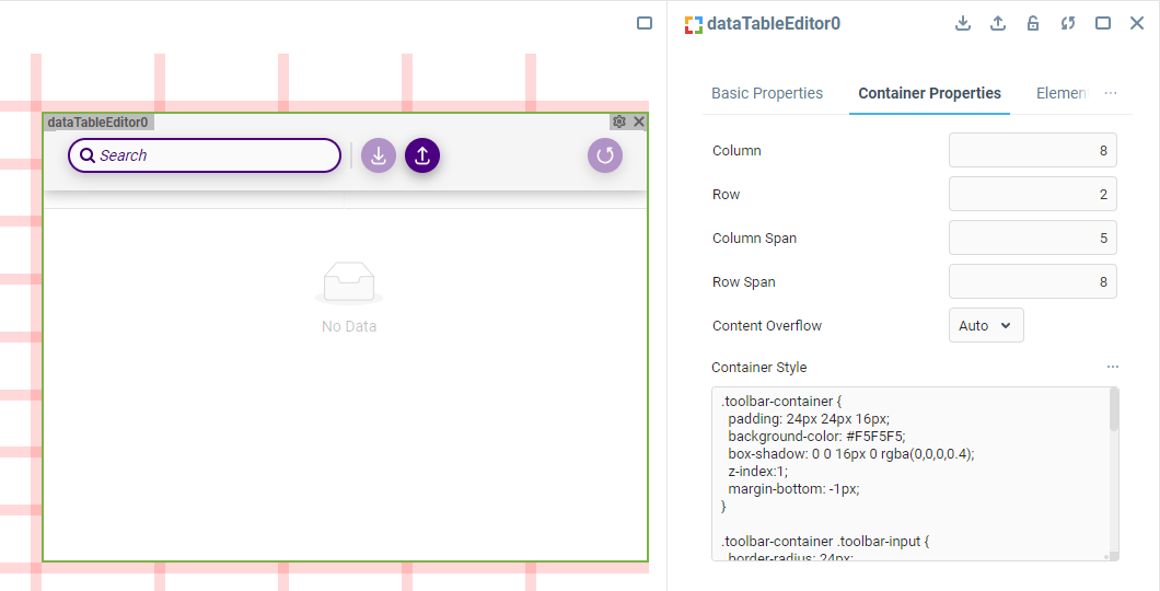
A toolbar doesn't have a dedicated custom CSS style property in the component Properties Editor. Working with its customization is supposed from the Container Style property of the component, like so:
.toolbar-container {
  padding: 24px 24px 16px;
  background-color: #F5F5F5;
  box-shadow: 0 0 16px 0 rgba(0,0,0,0.4);
  z-index:1;
  margin-bottom: -1px;
}

.toolbar-container .toolbar-input {
  border-radius: 24px;
  border: solid 2px indigo;
  box-shadow: 0 4px 12px 0 rgba(0,0,0,0.2);
}

.toolbar-container .toolbar-input #icon {
  fill: indigo;
}

.toolbar-container .toolbar-input input::placeholder {
  font-size: 14px;
  color: indigo;
}

.toolbar-section:not(:empty)::before {
  background-color: gainsboro;
  width: 2px;
}

.toolbar-container .toolbar-button {
  padding: 6px;
  background-color: indigo;
  box-shadow: 0 4px 12px 0 rgba(0,0,0,0.4);
}

.toolbar-container .toolbar-button #icon {
  fill: white;
}
 | To learn more about adding custom CSS to components in the UI Builder, visit the Applying CSS to Components section. |
Was this page helpful?