Tabbed Panel
A Tabbed Panel lets the user switch between a group of components by clicking on a tab with a given title. Every tab contains a separate pane of any layout that may hold other components or containers. |
|
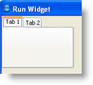
This is what a tabbed panel with two empty tabs looks like:

Common Properties
A Tabbed Panel supports the following common widget component properties:
Width, Height, Bindings, Enabled, Visible, Background, Opaque, Border, Cursor, Tooltip, Focusable, Popup Menu
And the following common container properties:
Scrolling, Smart Scrollbar Policy
Custom Properties
Active Tab
Name of active tab.
Property name: activeTab
Property type: String
Tab Visible
Controls visibility of tab switcher.
Property name: tabVisible
Property type: Boolean
Tab Placement
Placement of tab headers: Top, Left, Bottom or Right.
Property name: tabPlacement
Property type: Integer
Tab Layout Policy
Specifies how to place tabs if they don't fit a single row:
- Wrap Tabs. Create multiple rows of tabs.
- Scroll Tabs. Add scroll buttons to the tabbed pane header.
Property name: tabLayoutPolicy
Property type: Integer
Adding New Tabs
New tabs can be added to the tabbed panel by using the Add Tab context menu item of the Resources Tree node for the Tabbed Panel.
Tab Properties
Common properties: Layout, Bindings
Order Number
Order number of the tab. Tabs are shown according to their order numbers in ascending order.
Property name: index
Property type: Integer
Title
Title of the tab.
Property name: title
Property type: String
Icon
Image shown next to the tab's title. If NULL, no image is displayed.
Property name: icon
Property type: Data Block
Enabled
Flag indicating whether tab can be activated.
Property name: enabled
Property type: Boolean
Foreground
Tab header font color.
Property name: foreground
Property type: Color
Background
Tab background color.
Property name: background
Property type: Color
Tooltip
Text of tab tooltip.
Property name: toolTipText
Property type: String
Common Events
Hidden, Shown, Moved, Resized, Mouse Clicked, Mouse Pressed, Mouse Released, Mouse Entered, Mouse Exited, Mouse Moved, Mouse Wheel Moved, Key Typed, Key Pressed, Key Released, Focus Gained, Focus Lost
Was this page helpful?
