Styling Dashboard Components
You can build completely functional web dashboards that take full advantage of the power of Iotellect using only components and the expression language. Once you have the elements of the dashboard working, you may wish to customize and improve the visual appearance. Elements of dashboard components can be controlled with CSS, applied either to individual components, to component containers or the entire dashboard. The following guide does not assume that you have any familiarity with the CSS language, but by the end, you should understand the fundamental concepts of adding styles to elements.
 | Iotellect offers powerful options for styling your web dashboards. Consult Styling the UI for a complete guide. |
1. Styling an Individual Component: Label and Container
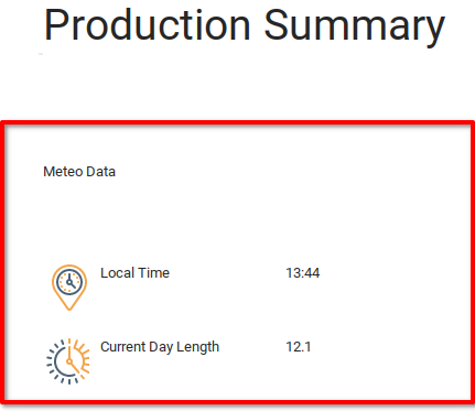
Continuing with the example created in the previous chapters Developing Operator Dashboards and Adding Device Data to Dashboards, you will learn how CSS can be used to create the desired appearance in your dashboards. The example of the Production Summary sub-dashboard currently looks like the below image. The following part of the tutorial will focus on styling of the Meteo Data component, indicated below in red.
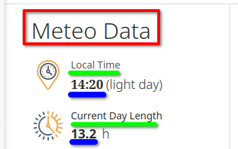
We will start by recalling the example dashboard created by the designer in User Interface Development. The design we currently have appears below. From here we can identify the first three styles to add to the current component: The header (red), the text labels (green) and the value labels (blue).
First, determine the styles that need to be implemented. If you don’t already have CSS styling ready to use, most modern browsers include a “developer tools” panel which,among other functions, allows you to understand what styles are being applied to certain components. In Firefox, the developer tools window can be opened with the hotkey ctrl+shift+I.
Inspecting the Meteo Data element of the design, we see a few styles applied to this component:
{ font: 300 32px / 40px "Open Sans", sans-serif; letter-spacing: 0px; color: rgb(41, 41, 41); }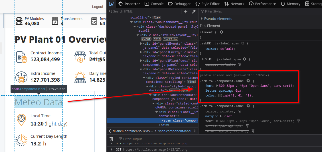
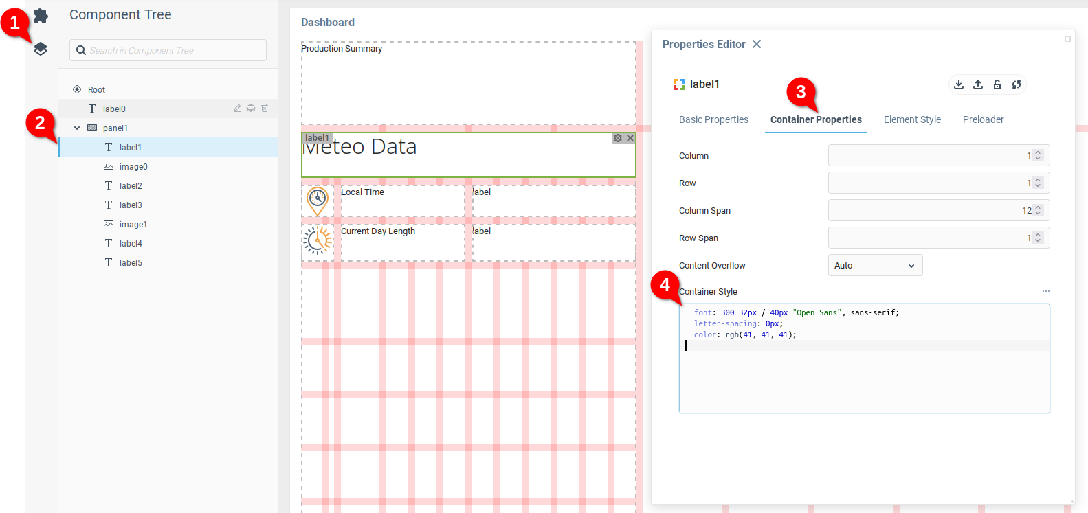
Now that you have some styling to add, open the Production Summary dashboard and select the Component Tree (1), from which you can find the label1 which holds the Meteo Data text. Navigate to the Container Properties tab of label1 (3) and place the desired styling in the Container Style text box (4). You will see the changes immediately displayed in the dashboard preview.
Styling elements individually is useful when creating styles for a few parts of the dashboard, such as the above example with a single header. However, this quickly becomes inconvenient when you need to apply the same styles to a number of elements.
2. Styling Multiple Components
Components in a dashboard have the Custom Classes property, allowing you to define an HTML Class for the component. By using the Class Selector capacity of CSS to apply a style to all elements of a given class, you can cascade a given style or styles to multiple dashboard components.
Assigning Custom Classes
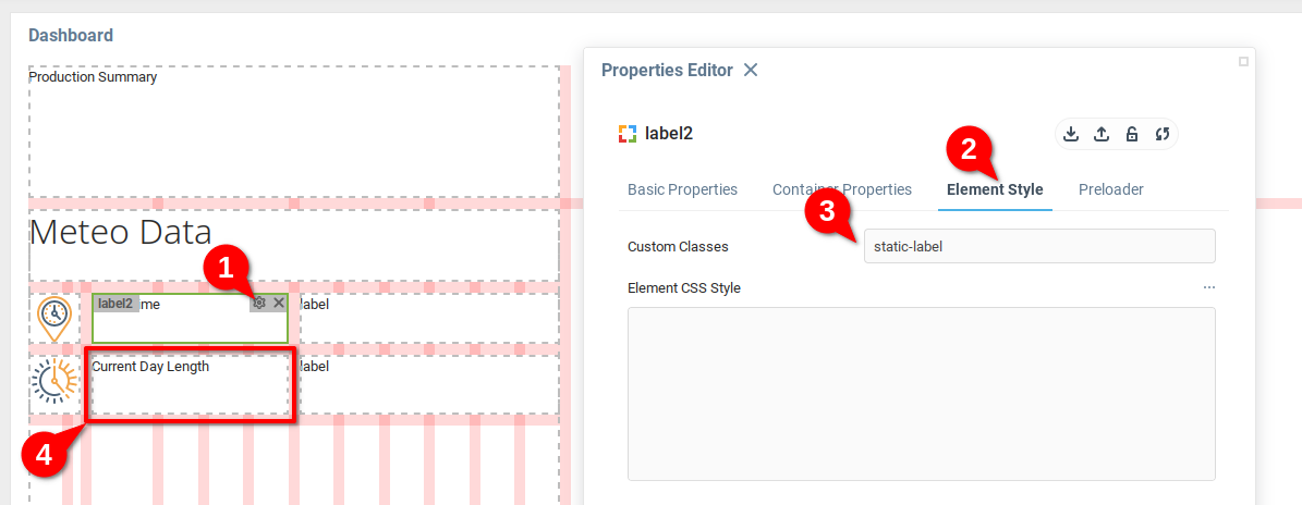
Start by opening the Properties editor for one of the static labels in the dashboard (1), navigating to the Element Style tab (2), and adding the value static-label to the Custom Classes property (3).
Repeat the process for the other static label (4).
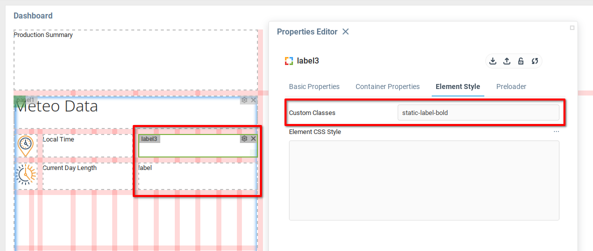
Repeat the previous step for the dynamically updated labels, but in this case, add the Custom Class static-label-bold.
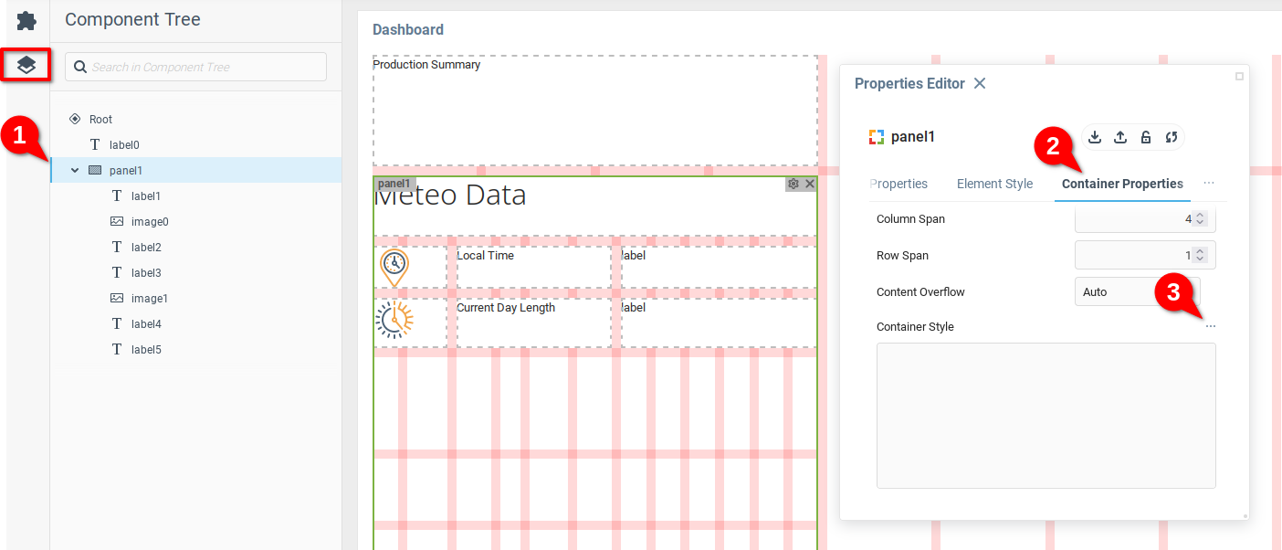
The next step is to add styling to the container panel1 which will be applied to the indicated components. Open the Properties Editor for panel1 (1), open the Container Properties tab (2), and then the Container Style text editor (3).
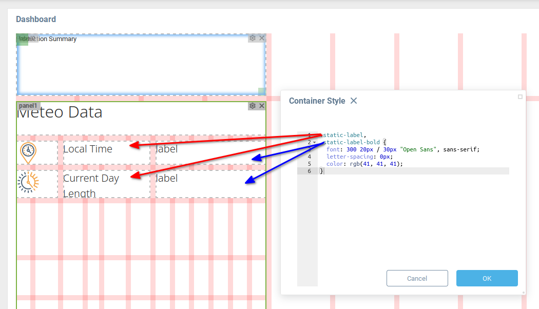
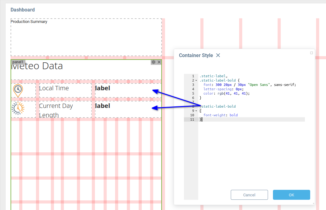
We will use two CSS rulesets to create the desired styles for the four Label components.
The first ruleset applies the same font and parameters to both the components with the custom CSS class static-label, as well as the components with custom class static-label-bold.
The ruleset used is:
.static-label,.static-label-bold { font: 300 20px / 30px "Open Sans", sans-serif; letter-spacing: 0px; color: rgb(41, 41, 41); }Below, you can see how the styles are displayed in the dashboard editor.
In order to apply a bold formatting to the values page, add the following ruleset to the container style.
.static-label-bold { font-weight: bold }As you can see, this ruleset is applied only to the components with custom class static-label-bold.
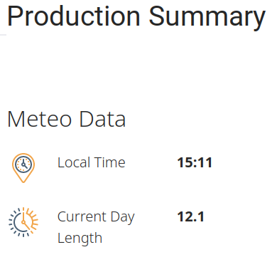
Looking at the dashboard preview, you can see that the styles are correctly applied.
3. Further Exploration with Styles
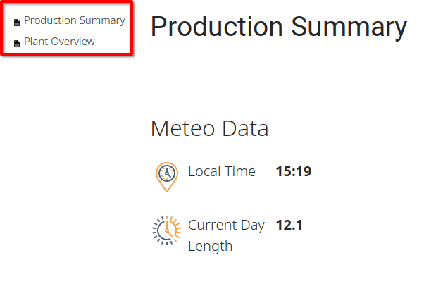
Looking at the Power Station dashboard, we can see that there is some missing styling in the sidebar menu. Some next steps might be to experiment with giving correct styling to the menu items, and adding some icons.
As a hint, the class selector for each item is .rc-tree li, and you would need to place any styles applied in the Power Station dashboard Root component. In the example below, we have used the indicated CSS ruleset in the Root component.
.rc-tree li { font: 300 15px / 30px "Open Sans", sans-serif; letter-spacing: 0px; color: rgb(41, 41, 41); }The above ruleset produces the following result in the Power Station sidebar menu:
Now that you have an understanding of how CSS can be used in Iotellect dashboards, you have a great deal of flexibility in determining how your components are displayed to the users.
Was this page helpful?