Component Properties Editor
To add custom CSS to a component in the UI Builder, you need to open its Properties Editor. The Properties Editor is used to change properties of different resources, and it is true for web components too. When properties are changed, changes are immediately saved and applied to the component.
Accessing Component Properties
You can get to a component Properties Editor in the UI Builder in several ways:
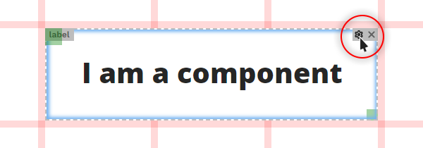
a) Hovering over a component on a dashboard with a cursor and clicking the (

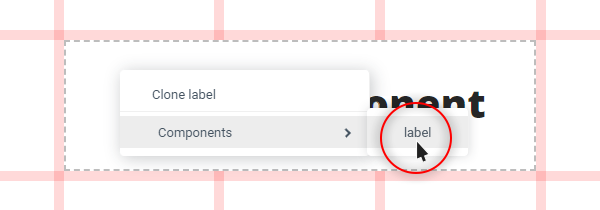
b) Opening a component’s context menu with a right click on the component and selecting its name from the list of the available components.

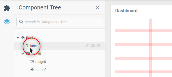
c) Selecting a component in the Component Tree.

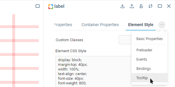
In the open component Properties Editor you can find a list of component properties divided into groups, presented as tabs at its top. Most of them are present across all web UI components, with some groups containing custom style properties for certain parts of the component.
Next, let’s have a look at where to head first in a component Properties Editor to find custom CSS properties, and where else you can come across them.
Property Groups with Custom CSS Support
The two main property groups where you will find yourself tinkering with component CSS most of the time are Container Properties and Element Style.
Besides those, there is the Tooltip group which is common for a lot of web UI components and also has a dedicated Style property.

Some components that have a lot of different parts inside them may have unique property groups with their own style fields. Explore the available property groups of each new UI component you start working with, and you might find more places to apply custom CSS from.
Was this page helpful?