Interval Bar Chart
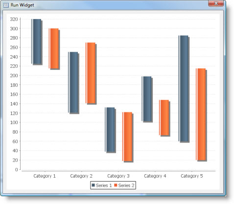
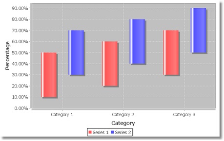
An interval bar chart shows an interval (that is, a start value and an end value) for each series/category value pair in the dataset. |
|
The area chart is based on Category Plot and Category Bar Renderer. It inherits all their properties.
This is what interval bar chart looks like:

Dataset
The interval bar chart supports Custom Data model only.
It has the following Source Data Bindings:
Binding | Expected Value Type | Description |
Series | String | Textual name of the data series. |
Category | String | Name of category. Categories are displayed along the domain axis. |
Start | Number | Interval start value for the above series/category. Values are displayed along the range axis. |
End | Number | Interval end value for the above series/category. |
Common Properties
Width, Height, Bindings, Visible, Opaque, Background, Border
Source Data and Source Data Bindings properties.
All properties of a Category Plot.
All properties of a Category Bar Renderer.
Custom Properties
None defined.
Common Events
Hidden, Shown, Moved, Resized, Mouse Clicked, Mouse Pressed, Mouse Released, Mouse Entered, Mouse Exited, Mouse Moved, Mouse Wheel Moved, Key Typed, Key Pressed, Key Released, Focus Gained, Focus Lost
All relevant chart events.
Additional Example
Another example of an interval bar chart:

Was this page helpful?
