Manipulating SVG Images
Iotellect has comprehensive support for SVG (Scalable Vector Graphics) images. It includes features such as transparency, arbitrary geometry, filter effects (shadows, lighting effects, etc.) and animation. Any SVG image can be scaled, rotated and flipped without losing its quality. A special Symbol Library provides a vast collection of SVG images with additional built-it functionality. These special images have dynamic properties for changing different visual aspects: color, lines thickness, animations etc.
This article shows how to manipulate SVG images and use them for creating interactive user interfaces. The tutorial will guide you to create a dashboard with two simple SVG components: a fan and an indicator light.
Creating a Dashboard
To create a new dashboard, right-click the System Tree Dashboards ( ) node and choose its Create Dashboard (
 ) action in the context menu. In the dialogue window set the Name property to
 svgManipulation, Description to SVG Manipulation, Destination as Web and Type as Relative.

From the context menu of the SVG Manipulation node in the system tree, select Edit Dashboard to start editing.

Adding Dashboard Components
We've selected the grid layout for simplicity, but any layout will work. Open the Component Palette (1) and drag a Vector Drawing (2) into a grid cell.

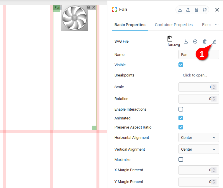
We open the Component Properties Editor (1), rename our component to Fan for ease of reference, allow for animations to be rendered in this component, and then load an image (2):

Now load the file images>scada>control>fan.svg from the Symbol Library. You should see it loaded into the grid cell. In order to customize the way it appears, we click the Edit button (1) to open a text editor of the SVG file.
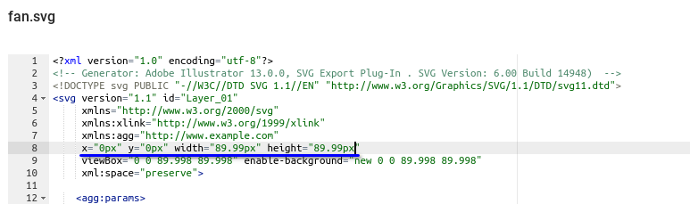
We'd like the image to take up the whole grid cell, so we change the indicated line to:
x="0px" y="0px" width="100%x" height="100%"
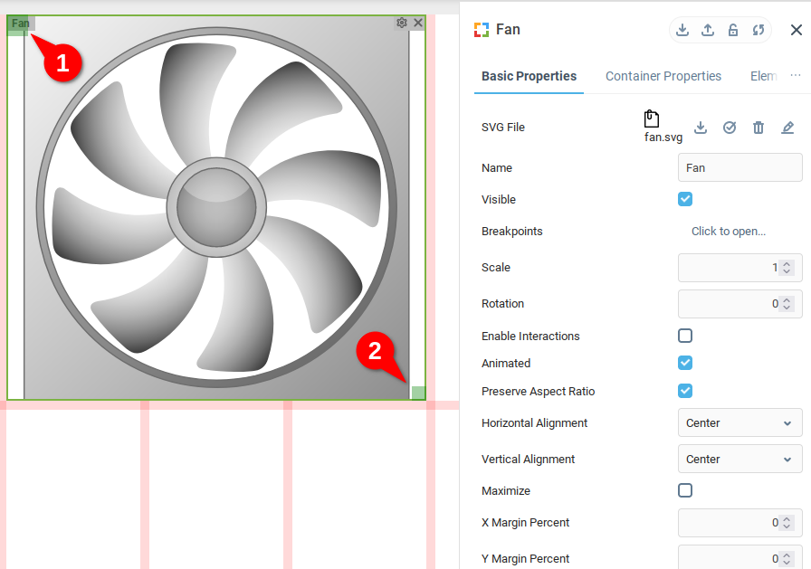
After saving the SVG text, we see that the image takes up the whole component, and we click and drag the top-left corner (1) to reposition the component, and the drag the bottom-right corner to resize the component.
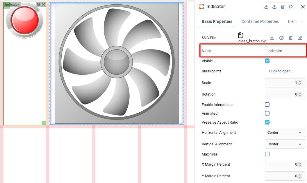
Drag and drop another Vector Drawing component from the component palette to the dashboard. Then load the button image images>scada>control>glass_button.svg from the Symbol Library as described above. We rename ours to Indicator.
Animating the Fan
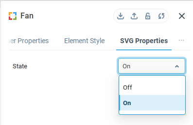
First, make the button to turn the fan rotation on. From the SVG Properties tab of the Fan Properties Editor we find the State property that turns rotation animation on and off.
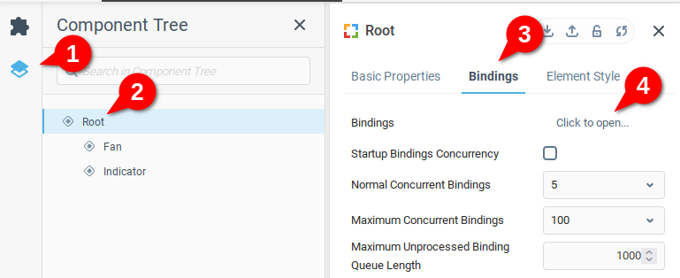
We will bind the State property of the Fan component to an event for easy observation, in this case clicking anywhere on the dashboard.
To do this, open the Component Tree (1) select the Root element (2) of the dashboard, Open the Bindings tab (3) and then the Bindings table (4)
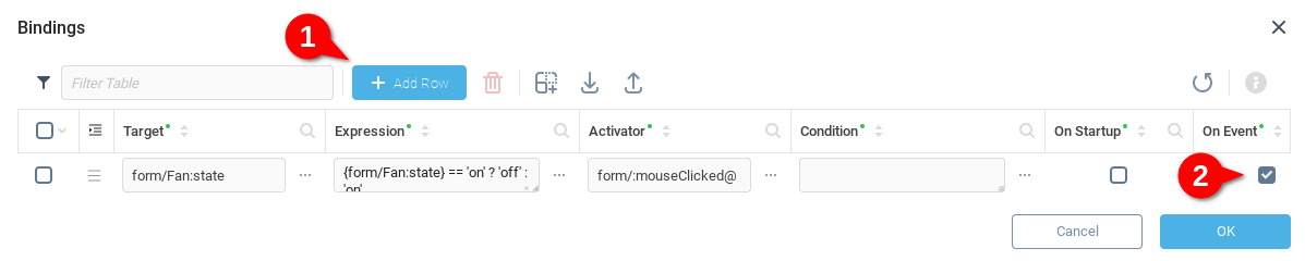
In the Bindings table window, add a new row (1) and select On Event (2). How to fill in the fields Target, Expression, and Activator is explained in detail below.
Target
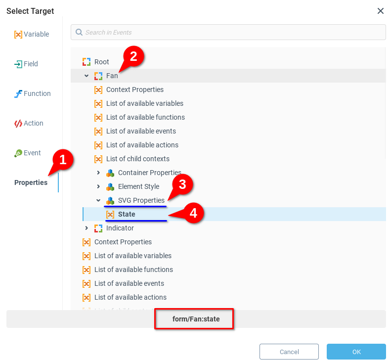
The Target property is the field that we want to edit as the result of our binding. We open the Select Target dialogue for the Target field by clicking the [...]. From here we select Properties (1), open the Fan node (2), find the SVG Properties node (3) and select the State variable (4). At the bottom, we see the text which indicates the target: form/Fan:state. Upon clicking OK, we see the value saved in the Target field.
Expression
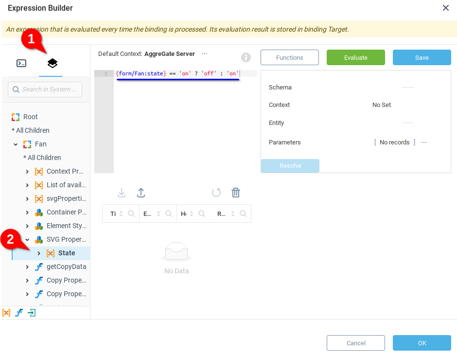
Opening the Expression Builder to edit the Expression field by clicking the [...] button, we select the Component Tree (1), and then find the State variable (2) under SVG Properties node. Mousing over the State variable gives the option to insert {>} the variable reference into the expression builder {form/Fan:state}.
In order to toggle the fan state between 'off' and 'on', we create a conditional statement {form/Fan:state} == 'on' ? 'off' : 'on' and then click OK.
Activator
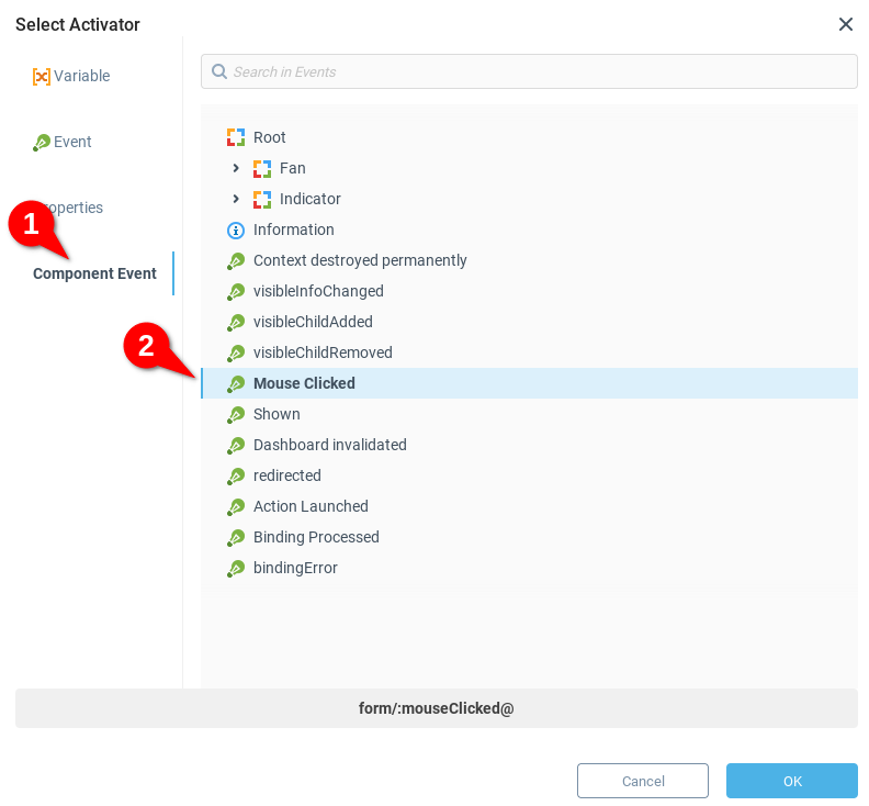
For the Activator field, click [...] to open the Activator dialog. Select the Component Event tab (1) and select the event Mouse Clicked (2). Click OK to confirm. This activator will run the binding every time a click on the root dashboard is performed.
Animating the Indicator
Now let's allow the button to light up in green when the fan is turned on. Add another row to the Bindings table and set the binding properties using the example values:
Target
form/Indicator:colorExpression
{form/fan:state} == 'on' ? color(255,0,0) :color(0,255,0)Activator
form/:mouseClicked@
 | The expression includes a color function that returns a color with the specified red, green and blue values. To insert functions in expressions you can use the Function Chooser dialog opened by the Functions button of the Expression Builder dialog. Here we've selected the Color Processing category 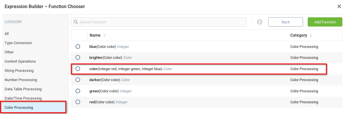 |
Saving and Running the Dashboard
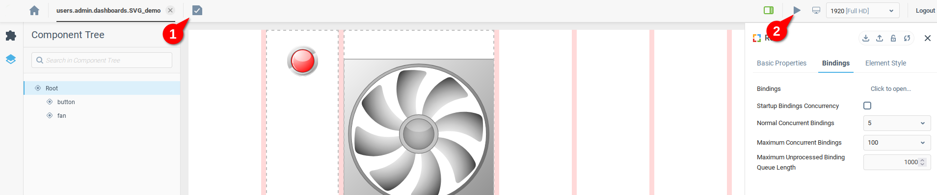
Click Save (1) to save your work, and to see the it in action choose Launch Dashboard (2).
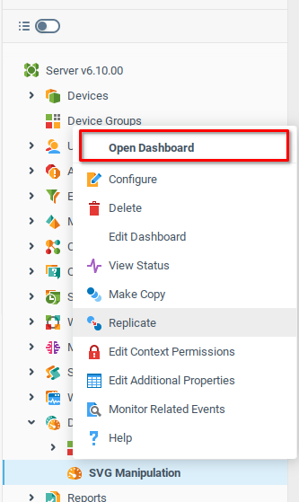
SVG Manipulation dashboard context should also appear in the System Tree, and can be launched from the context menu:
The completed Dashboard might look something like this:

In this tutorial you've learned how to create dashboard elements with dynamic SVG images. Now you can combine controls and use them for building complex user interfaces.
Was this page helpful?