Tooltips
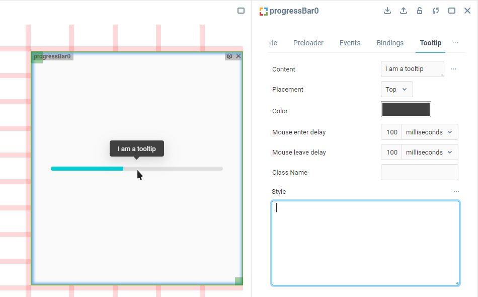
A tooltip is a message box with a hint or other information which appears when a component is hovered over with a cursor and hides back when the cursor leaves the component area.
Tooltips are so common across many Iotellect web UI components, that the element has its own property group in the Properties Editor of the web components supporting it.

The Content property allows adding complex HTML markup inside a tooltip, so the local Style property is useful not only for changing the tooltip appearance, but also for styling the markup that is added there by a user.
Custom HTML class for the outermost tooltip wrapper can be assigned via the Class Name property similar to the Custom Classes property in the Container Properties group.
Tooltip Markup
Tooltips are rendered way outside the component’s Container, within a <div> element located directly in the document’s <body>. A tooltip has the following markup:
<div class="ant-tooltip-content">
    <div class="ant-tooltip-arrow">
        <span class="ant-tooltip-arrow-content" style="background: value;"></span>
    </div>
    <div class="ant-tooltip-inner" id="<generated gibberish>" role="tooltip" style="background: value;">
        <div>Tooltip content here</div>
    </div>
</div>Changing Tooltip Style
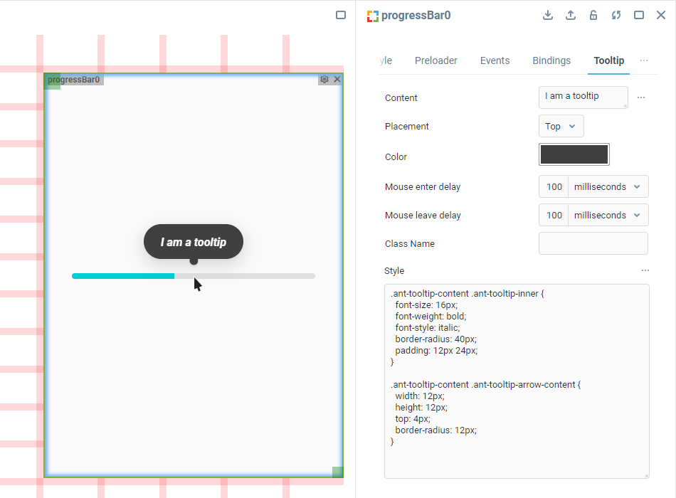
To apply custom styles to a component’s tooltip, find the Tooltip tab in the component Properties Editor and use this markup as the base for CSS rules to add into the local Style property, like so:
.ant-tooltip-content .ant-tooltip-inner {
  font-size: 16px;
  font-weight: bold;
  font-style: italic;
  border-radius: 40px;
  padding: 12px 24px;
}

.ant-tooltip-content .ant-tooltip-arrow-content {
  width: 12px;
  height: 12px;
  top: 4px;
  border-radius: 12px;
}
 | To learn more about adding custom CSS to components in the UI Builder, visit the Applying CSS to Components section. |
Was this page helpful?