Arrow
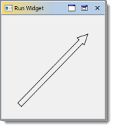
This component displays a possibly filled arrow. |
|
This is what an arrow component looks like:

Common Properties
Width, Height, Bindings, Enabled, Visible, Foreground, Background, Opaque, Border, Font, Cursor, Tooltip, Popup Menu
Custom Properties
Stroke
A stroke used to draw the arrow.
Property name: stroke
Property type: Data Table
Arrow Width
Defines width of the arrow.
Property name: arrowWidth
Property type: Float
Tip Length
Defines length of an arrow tip.
Property name: tipLength
Property type: Float
Tip Width
Defines width of an arrow tip.
Property name: tipWidth
Property type: Float
Common Events
Hidden, Shown, Moved, Resized, Mouse Clicked, Mouse Pressed, Mouse Released, Mouse Entered, Mouse Exited, Mouse Moved, Mouse Wheel Moved, Key Typed, Key Pressed, Key Released, Focus Gained, Focus Lost
Was this page helpful?
