Interval Chart
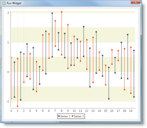
An interval chart displays lines indicating a y-interval corresponding to each x-value. |
|
The interval chart is based on XY Plot and XY Renderer. It inherits all their properties.
This is what interval chart looks like:

Dataset
The interval chart supports Custom Data model only.
It has the following Source Data Bindings:
Binding | Expected Value Type | Description |
Series | String | Textual name of the data series. |
X | Number | Numeric value to display along the domain (X) axis. |
Y Low | Number | Y-interval lower bound. |
Y High | Number | Y-interval upper bound. |
Additional dataset properties:
Auto Sort
Flag that controls whether the items in the series are automatically sorted into ascending order by x-value.
Property name: autoSort
Property type: Boolean
Allow Duplicate X Values
Flag that controls whether two or more items in the series can have the same x-value.
Property name: allowDuplicateXValues
Property type: Boolean
Common Properties
Width, Height, Bindings, Visible, Opaque, Background, Border
All Data-related properties.
All properties of a XY Plot.
All properties of a XY Renderer.
Custom Properties
Additional Item Label Generator
An additional item label generator. If this is non-null, the item label generated will be displayed near the lower y-value at the Negative Item Label Position.
Property name: lowItemLabelGenerator
Property type: Data Table
Common Events
Hidden, Shown, Moved, Resized, Mouse Clicked, Mouse Pressed, Mouse Released, Mouse Entered, Mouse Exited, Mouse Moved, Mouse Wheel Moved, Key Typed, Key Pressed, Key Released, Focus Gained, Focus Lost
All relevant chart events.
Additional Examples
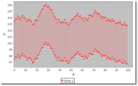
A simple interval chart with one data series:

Was this page helpful?
