Split Panel
A Split Panel is used to divide two (and only two) other components or containers that are called frames. These components are displayed either side by side or one on top of the other. Space available for each of these components may be interactively re-distributed by the user. |
|
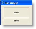
This is what a split panel with horizontal orientation holding two labels looks like:

 | It's possible to divide space among three or more components by putting split panels inside of other split panes. |
Common Properties
A Split Panel supports the following common widget component properties:
Width, Height, Bindings, Enabled, Visible, Background, Opaque, Border, Cursor, Tooltip, Focusable, Popup Menu
And the following common container properties:
Scrolling, Smart Scrollbar Policy
Custom Properties
Orientation
Horizontal or vertical. A split panel with horizontal orientation has a left frame and a right frame, while a vertically oriented split panel has a top frame and a bottom frame.
Property name: orientation
Property type: Integer
Divider Location
Divider location in pixels from the left or top side of split panel.
Property name: dividerLocation
Property type: Integer
Divider Size
Divider size in pixels.
Property name: dividerSize
Property type: Integer
Frame Properties
Common properties: Layout, Bindings
Order Number
Order number of the frame. A frame with lower number is located in the left part (or in the top part -- for a Split Panel with vertical layout) or the Split Panel.
Property name: index
Property type: Integer
Common Events
Hidden, Shown, Moved, Resized, Mouse Clicked, Mouse Pressed, Mouse Released, Mouse Entered, Mouse Exited, Mouse Moved, Mouse Wheel Moved, Key Typed, Key Pressed, Key Released, Focus Gained, Focus Lost
Was this page helpful?
