Layered Panel
A Layered Panel has several panes that are rendered one over another. Each pane has a separate layout. |
|
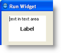
This is what a layered panel with two layers containing a text area and a label looks like:

Common Properties
A Layered Panel supports the following common widget component properties:
Width, Height, Bindings, Visible, Background, Opaque, Border, Cursor, Tooltip, Focusable, Popup Menu
And the following common container properties:
Scrolling, Smart Scrollbar Policy
Custom Properties
A Layered panel has no custom properties.
Adding New Layers
New layers can be added to the layered panel by using Add Layer context menu item of the Resources Tree node for the Layered Panel.
Layer Properties
Common properties: Layout, Bindings
DEPTH
Depth of the layer, that is also called z-order. Layers with lower depth are rendered over the layers with higher depth.
Property name: depth
Property type: Integer
Common Events
Hidden, Shown, Moved, Resized, Mouse Clicked, Mouse Pressed, Mouse Released, Mouse Entered, Mouse Exited, Mouse Moved, Mouse Wheel Moved, Key Typed, Key Pressed, Key Released, Focus Gained, Focus Lost
Was this page helpful?
