Vector Drawing
This component displays a Scalable Vector Graphics (SVG) drawing. Documents created as dynamic vector images will display custom properties which can be modified by while the image is displayed. The tutorial Manipulating SVG images shows how to leverage custom properties in user interface designs. |  |
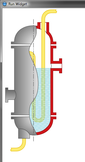
This is what a vector drawing component can look like:

Common Properties
Width, Height, Bindings, Visible, Border, Cursor, Popup Menu
Custom Properties
SVG File
SVG file to display.
Property name: drawing
Property type: Data Block
Enable Interactions
When interactions are enabled it is possible to manipulate vector drawing in the widget window using the following keyboard/mouse shortcuts:
Shortcut | Meaning |
| Magnify (zoom region) |
| Zoom |
| Pan |
| Rotate |
| Reset transformations |
Animated
This option should be enabled for images that contain SVG animation.
Property name: animated
Property type: Boolean
Quadrant Rotation
Rotates the drawing to fixed angles: 0°, 90°, 180°, 270°. The value is the number of 90° arcs to rotate by. If Preserve Aspect Ratio is enabled and the drawing is in Absolute Layout rotating to 90° or 270° flips component's bounding box width/height.
Property name: quadrantRotation
Property type: Integer
 | When quadrant rotation differs from 0° the Rotation property is disabled and ignored. |
Flip Horizontal
Flips the drawing around horizontal axis.
Property name: flipHorizontal
Property type: Boolean
Flip Vertical
Flips the drawing around vertical axis.
Property name: flipVertical
Property type: Boolean
Scale
Scaling index. Value of 1.0 is used to disable scaling.
 | If scaled and rotated drawing doesn't fit the component's box, it will be cropped. |
Property name: scale
Property type: Float
Rotation
Scaling angle, in degrees.
 | If scaled and rotated drawing doesn't fit the component's box, it will be cropped. |
Property name: rotation
Property type: Float
Effective Rotation
Displays the element’s final visual rotation in degrees, calculated as the sum of the element’s own rotation and the rotation of all its parent groups.
 | If a group is rotated 30° and a child element is rotated 20°, the effective rotation is 50°. This value is read-only and is updated dynamically. |
Property name: effectiveRotation
Property type: Float
Transform Origin
Defines the pivot point around which all transformations (rotation, scaling, etc.) are applied. This point serves as the anchor for the element’s transformation matrix. Can be set by coordinates or adjusted interactively in the editor.
Property name: transformOrigin
Property type: Point
Preserve Aspect Ratio
Enables/disables preserving the drawing's aspect ratio. If preserving is disabled, the drawing stretches to occupy the whole component's space. When preserving is enabled and the drawing is in Absolute Layout, component's borders resize proportionally.
Property name: preserveAspectRatio
Property type: Boolean
 | When preserving aspect ratio is disabled, Horizontal/Vertical Alignment properties are also disabled. |
 | Ignoring aspect ratio is useful when you need non-proportional scaling, for example when constructing pipelines consisting of different pipe segments. |
Horizontal Alignment
Defines the drawing horizontal alignment when the component's area is wider then the drawing: Left, Center, Right.
Property name: horizontalAlignment
Property type: String
Vertical Alignment
Defines the drawing vertical alignment when the component's area is higher then the drawing: Top, Center, Bottom.
Property name: verticalAlignment
Property type: String
Maximize
Enables automatic magnification of the drawing so that its margins (i.e. empty space around the image) are discarded.
 | When Maximize is checked, X/Y Margin Percent properties are enabled. Setting small X/Y margins can be used to prevent edges clipping when the drawing size is automatically detected. |
Property name: maximize
Property type: Boolean
X Margin Percent
X margin as a percentage of drawing width. Enabled when the Stretch To Fit is checked.
Property name: xMarginPercent
Property type: Float
Y Margin Percent
Y margin as a percentage of drawing height. Enabled when the Stretch To Fit is checked.
Property name: yMarginPercent
Property type: Float
Custom SVG Properties
SVG images included into some Iotellect distribution bundles are enhanced to support custom properties. These properties are defined as special extensions which can be added to most SVG files. The Vector Drawing component decodes these properties from SVG files and exposes them as "normal" component properties, allowing them to be edited inside the GUI Builder, manipulate them with widget bindings, and more.
The custom properties are visible in a separate SVG Properties group. The typical custom SVG properties are:
Fill color (e.g. element colors)
Stroke width and color (e.g. outline strokes)
Rotation angle (e.g. gauge arrows)
Animation trigger (e.g. fan start/stop switches)
Element positions (e.g. tanks levels, damper positions)
And many more (push button positions, etc.)
Common Events
Hidden, Shown, Moved, Resized, Mouse Clicked, Mouse Pressed, Mouse Released, Mouse Entered, Mouse Exited, Mouse Moved, Mouse Wheel Moved, Key Typed, Key Pressed, Key Released, Focus Gained, Focus Lost
Custom Events
Element Mouse Clicked
This event is fired when a mouse button is clicked over the vector drawing element.
Event name: elementMouseClicked
Event fields: The element mouse clicked event has all fields of a regular mouse event (excluding ID, Modifiers, Alt Graph Down, Extended Modifiers and Popup Trigger). Additionally, it defines the following fields:
Field | Name | Type | Description |
ID | id | String | Vector drawing element ID. |
Class | class | String | Vector drawing element class. |
Title | title | String | Vector drawing element title. |
Element Mouse Entered
This event is fired when a mouse cursor enters the vector drawing element area.
Event name: elementMouseEntered
Event fields: The element mouse entered event has all fields of the event elementMouseClicked.
Element Mouse Exited
This event is fired when a mouse cursor leaves the vector drawing element area.
Event name: elementMouseExited
Event fields: The element mouse exited event has all fields of the event elementMouseClicked.
Was this page helpful?