XY Bar Chart
An XY bar chart represents (X, Y) data items as rectangular bars. |
|
The line chart is based on XY Plot and XY Renderer. It inherits all their properties.
This is what XY bar chart looks like:
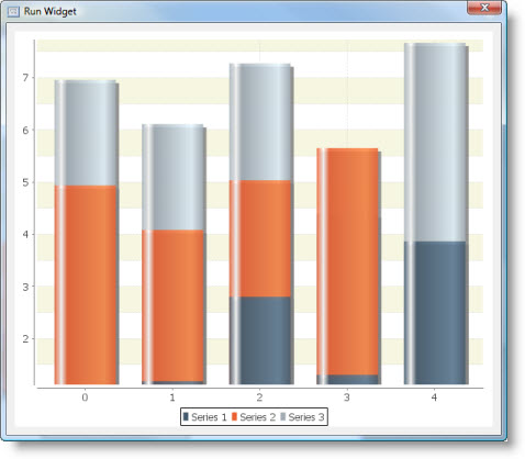
XY bar chart supports three renderers:
Simple Renderer
A "classic" bar renderer.
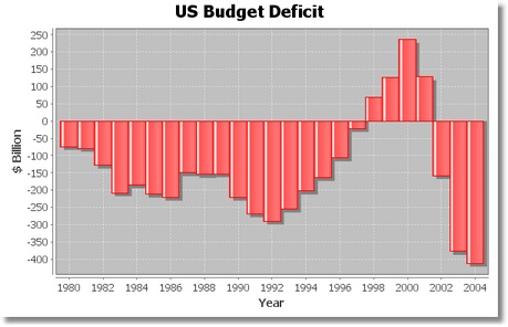
The below example uses Date Axis as an x-axis.
Stacked Renderer
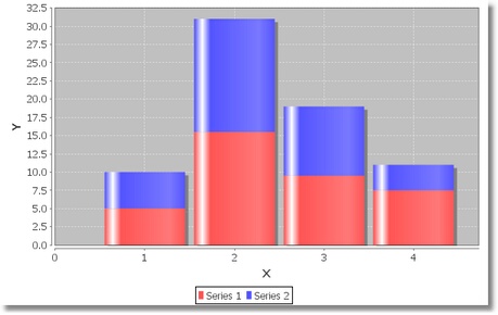
A renderer for drawing stacked bar charts on an XY Plot.
All series must share the same set of x-values to allow values to be stacked.
Clustered Renderer
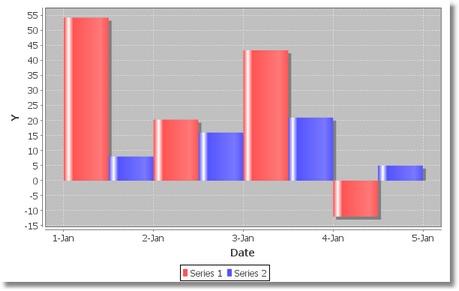
This render slightly differs from the Simple Renderer, in that it adjusts the position and width of each of the bars, making the assumption that the bars for all the series should be clustered within the same x-interval.
The below example uses Date Axis as an x-axis.
Dataset
The XY bar chart supports several data models:
It has the following Source Data Bindings:
Binding | Expected Value Type | Description |
Series | String | Textual name of the data series. Data series is represented by a single line (or set of shapes) on the chart. |
X | Number | Bar position anchor along the domain (X) axis. It is unused if Bar Alignment Factor is negative. See Bar Alignment Factor for details. |
X Low | Number | The lower margin of the bar along the domain (X) axis or a part of bar's width. See Bar Alignment Factor for details. |
X High | Number | The upper margin of the bar along the domain (X) axis or a part of bar's width. See Bar Alignment Factor for details. |
Y Low | Number | The beginning of a bar at the range (Y) axis. Unused if Use Y Interval is disabled. |
Y High | Number | The end of a bar at the range (Y) axis. |
Additional dataset properties:
Auto Sort
Flag that controls whether the items in the series are automatically sorted into ascending order by x-value.
Property name: autoSort
Property type: Boolean
Common Properties
Width, Height, Bindings, Visible, Opaque, Background, Border
All Data-related properties.
All properties of a XY Plot.
All properties of a XY Renderer.
Bar Shadows
Shadows Visible
Flag that controls whether or not shadows are drawn for the bars.
Property name: shadowsVisible
Property type: Boolean
Shadow Paint
Paint used to fill the bar shadows.
Property name: shadowPaint
Property type: Data Table
Shadow X Offset
X-offset for the bar shadows.
Property name: shadowXOffset
Property type: Float
Shadow Y Offset
Y-offset for the bar shadows.
Property name: shadowYOffset
Property type: Float
Item Labels
Due to the rectangular nature of the bars, the renderer calculates anchor points that are arranged as shown in figure below. Note that the numbers correspond (roughly) to the position of the hours on a clock face.
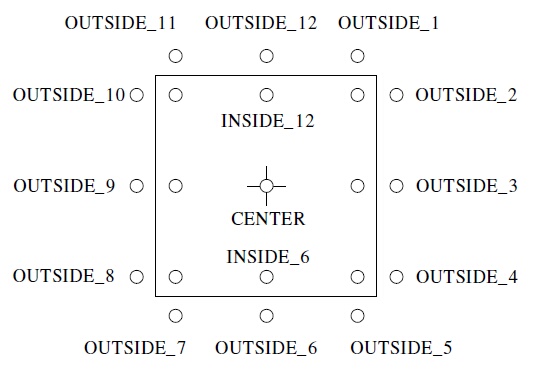
When an item label is displayed inside a bar, the renderer will calculate if the bar is large enough to contain the text. If not, the renderer will check to see if a "fallback" label position has been specified. If there is a fallback position, the label is displayed there, and if there is no fallback position the label is not displayed at all. Two fallback positions can be specified, one for positive values and one for negative values (this covers the standard case where positive value labels that don't fit within a bar should be displayed above the bar, and negative value labels that don't fit within a bar should be displayed below the bar).
Item Label Position Fallback
This property includes two values:
- Positive Item Label Position: fallback position for positive item labels. Set the value to null if you prefer labels to be hidden if they don't fit within the bar.
- Negative Item Label Position: fallback position for negative item labels. Set the value to null if you prefer labels to be hidden if they don't fit within the bar.
Property name: itemLabelPositionFallback
Property type: Data Table
Other Properties
Margin
Margin for the renderer. The margin is specified as a percentage of the bar width (for example, 0.10 is ten percent) and is the amount that is trimmed from the bar width before the bar is displayed.
Property name: margin
Property type: Float
Draw Bar Outline
Flag that controls whether or not an outline is drawn around each bar. The paint and stroke used for the bar outline are specified using properties of a base chart renderer.
Property name: drawBarOutline
Property type: Boolean
Base
Base value for the bars.
By default, the renderer draws a bar between zero (the base value) and the data value of the item to be displayed. Some specialized bar charts require a non-zero base value.
Property name: base
Property type: Float
Use Y Interval
Flag that controls how the length of the bars is determined. If true, the y-interval from the dataset is used. If false, the y-value from the dataset determines one end of the bar, and the Base property determines the other end of the bar.
Property name: useYInterval
Property type: Boolean
Bar Alignment Factor
Bar alignment factor. If the alignment factor is in the range 0.0 to 1.0, then the bar width is determined by the x-interval from the dataset, while the bar position is adjusted so that the x-value from the dataset falls at the specified relative position within the bar (for example, 0.0 places the bar so that the x-value is at the left side of the bar, 0.5 places the bar so that the x-value is at the center of the bar, and 1.0 places the bar so that the x-value is at the right side of the bar). If the alignment factor is outside the range 0.0 to 1.0, no alignment will be performed by the renderer (in this case the bar position is determined by the x- interval in the dataset only, and the x-value is ignored).
Property name: barAlignmentFactor
Property type: Float
Bar Painter
Bar Painter takes care of the actual drawing of individual bars. It has the following properties:
Property | Name | Type | Description |
Type | type | Integer | Painter type: Standard or Gradient:
|
G1 | g1 | Float | The division point between the first and second gradient regions (greater than 0.0). |
G2 | g2 | Float | The division point between the second and third gradient regions (greater than G1). |
G3 | g3 | Float | The division point between the third and fourth gradient regions (greater than G2 and less than 1.0). |
Property name: barPainter
Property type: Data Table
Legend Bar
Shape used to represent a bar in each legend item.
Property name: legendBar
Property type: Data Table
Other Properties
Render as Percentages
Flag that controls whether the renderer displays the values as percentage of the total across all series.
Example of chart that renders percent values:
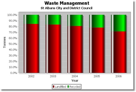
This property is valid for Stacked renderer.
Property name: renderAsPercentages
Property type: Boolean
Center Bar at Start Value
Flag that controls whether or not the cluster of bars is shifted so that it centers around the starting x-value returned by the dataset.
Property name: centerBarAtStartValue
Property type: Boolean
Common Events
Hidden, Shown, Moved, Resized, Mouse Clicked, Mouse Pressed, Mouse Released, Mouse Entered, Mouse Exited, Mouse Moved, Mouse Wheel Moved, Key Typed, Key Pressed, Key Released, Focus Gained, Focus Lost
All relevant chart events.
Additional Examples
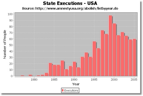
A bar chart created using range axis of Date type. The chart uses a subtitle to cite the data source:
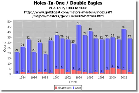
A stacked XY bar chart based on a date domain axis:
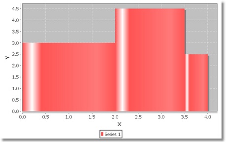
A chart that shows varying bar widths. The Bar Alignment Factor is negative, and X coordinates of bar's left and rights sides are based on X Low and X High values from the dataset:
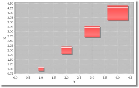
A chart with "floating" bars. The Bar Alignment Factor is negative, and X coordinates of bar's left and rights sides are based on X Low and X High values from the dataset. Use Y Interval is enabled, so bars are drawn from Y Low to Y High dataset values:
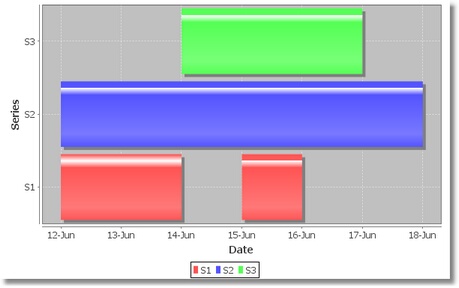
Bar chart that displays different intervals along the date X-axis:
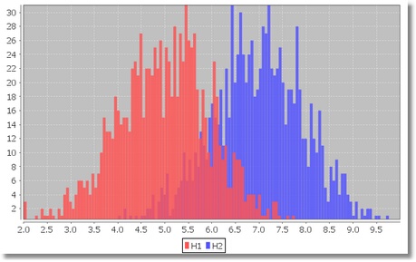
A simple histogram with two data series built using an XY bar chart:
Was this page helpful?
