Date/Time Picker
A component that is used to choose a date, using a drop-down popup. It combines an editable field and a popup. |
|
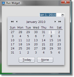
Here is what a Date Time Picker looks like:

The component supports a keyboard-only environment:
Key | Action |
ALT + DOWN | Bring up the popup |
ESC | Hide the popup without changing the selection |
LEFT | Previous day of the selected day |
RIGHT | Next day of the selected day |
UP | Same day of the last week |
DOWN | Same day of the next week |
HOME | First day of this month |
END | Last day of this month |
PAGE_UP | Same day of the last month |
PAGE_DOWN | Same day of the next month |
CTRL + PAGE_UP | Same day of the last year |
CTRL+ PAGE_DOWN | Same day of the next year |
ENTER | Select the highlighted date and hide popup |
Common Properties
Width, Height, Bindings, Enabled, Visible, Foreground, Background, Opaque, Border, Font, Cursor, Tooltip, Focusable, Popup Menu
Custom Properties
Date
Picked date.
Property name: date
Property type: Date
Editable
Determines if the text field is editable. When it is set to false, the date can only be chosen from a popup but not entered by a keyboard.
Property name: editable
Property type: Boolean
Format
Date/time format for a value presented in the field.
Property name: format
Property type: String
Minimum Date
Minimum allowed date.
Property name: minDate
Property type: Date
Maximum Date
Maximum allowed date.
Property name: maxDate
Property type: Date
Time Displayed
Determines if a time edit field is displayed in the date chooser popup. Enabling it gives the ability to specify the time as well as the date.
Property name: timeDisplayed
Property type: Boolean
Time Format
Defines the format of time displayed in the popup.
Property name: timeFormat
Property type: String
Controls the Today button visibility.
Property name: showTodayButton
Property type: Boolean
Controls the None button visibility. None button allows to select NULL date value.
Property name: showNoneButton
Property type: Boolean
Controls the OK button visibility.
Property name: showOKButton
Property type: Boolean
Show Week Numbers
Determines whether week numbers are visible in the picker panel.
Property name: editable
Property type: Boolean
Enables custom buttons colors.
Property name: useCustomButtonProperties
Property type: Boolean
Sets background, foreground and border colors for Date/Time Picker's UI elements.
Property name: buttonProperties
Property type: Data Table
Common Events
Hidden, Shown, Moved, Resized, Mouse Clicked, Mouse Pressed, Mouse Released, Mouse Entered, Mouse Exited, Mouse Moved, Mouse Wheel Moved, Key Typed, Key Pressed, Key Released, Focus Gained, Focus Lost
Was this page helpful?
