Graph
Graph component displays and dynamically updates a graph of any kind. For example, a network topology graph. |
|
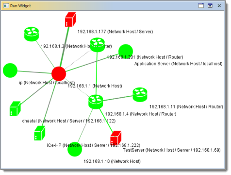
The following figure shows a network topology displayed as a graph.
Graph Elements
Graphs displayed by the Graph component consist of nodes and edges. Nodes are vertices of the graph. Edges are connections between the nodes. For example, a network topology graph has hosts as nodes and connections between them as edges.
Two nodes can have more than one edge that connects them. In this case, an edge originates at some interface of a first node and connects to another interface of a second node.
The background of the displayed graph is the canvas.
Each graph node has an underlying object. It means that each displayed node represents some context. You can access these underlying object via graph actions described below. For example, a network topology nodes can represent network devices.
Node Color Coding
The color of a graph node indicates the state of its underlying objects.
 | Example: On a network topology graph, a green node indicates that the network device is online and has no problems. Red nodes are offline devices and devices with problems. |
Node Labels
Each graph node has a label that describes its underlying object. Node labels are defined in the Node Description Expression property.
 | Example: On a network topology map, node labels show descriptions of device contexts. |
Edge Width and Color Coding
Width of graph edges may vary depending on the type of the underlying object.
 | Example: On a network topology map, narrow edges are low-speed connections (for example, 100 Mbps links). Wide edges represent high speed links (for example, Gigabit Ethernet). |
Edge color indicates node-to-node link statuses.
 | Example: On a network topology map, each edge may have different colors on its opposite sides. A green edge side indicates that the network interface that corresponds to this link is online. A red edge side points to an offline interface. |
Graph Actions
Opening Nodes
You can double-click graph nodes to execute a preferred action. For example, you can open dashboards of the devices that correspond to graph nodes.
If Preferred Action Name Expression property is not specified, context's default action will be launched.
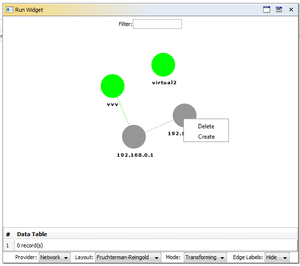
Right-clicking a graph element brings an actions menu for it.
For nodes, this opens a menu defined in the Vertex Popup Menu property. For edges, this opens a menu defined in the Edge Popup Menu property.

Zooming and Panning Graph
You can pan a graph by clicking a certain point and dropping it over another map location. This will move the center of the graph accordingly.
 | Panning works only when the graph is in the Transforming mode. |
 | If graph is in the Picking mode, it is possible to Ctrl-click on a node to center graph on this node. |
You can Zoom into and from the current mouse location by using the mouse wheel.
Rotating and Shearing Graph
Shift-click and drag in the graph window allows you to rotate the graph.
Ctrl-click and drag in the graph window allows you to shear the graph.
 | Rotating and shearing work only when the graph is in the Transforming mode. |
Picking and Moving Nodes
If a graph is in the Picking mode, you can pick and move its nodes by dragging them with the mouse.
You can select multiple nodes:
- By clicking outside of any node and dragging the mouse to select a certain graph area that includes several nodes.
- By Shift-clicking on several nodes.
Creating Links
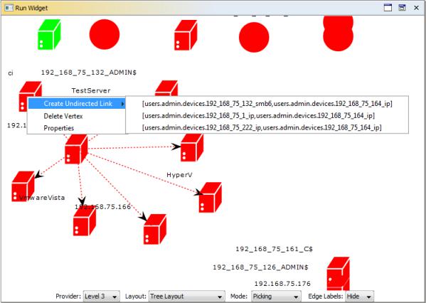
To create a new link, select a group of nodes in the Picking mode. Right-click on one of them. Hover on "Create Undirected Link" and select a new link.
Deleting Edges
To delete an edge, create an action in the Edge Popup Menu property with the deleteEdge name. Right-click on the edge and select the delete option.
Deleting Nodes
To delete a node, create an action in the Vertex Popup Menu property with the deleteVertex name. Right-click on the node and select delete option.
Saving, Deleting and Restoring Graph Layout
Layout of a graph is defined by the positions of its nodes.
A graph component can save its current layout in the Iotellect Server database. This does not require any user actions. Saving a current layout is a transparent operation. When a user opens a dashboard or a widget with a graph component, the graph layout is restored from the database based on a given topology provider and a graph layout type. When a widget or a dashboard with a graph component is closed, the changed nodes of a graph are stored in the database. You can control the saving and restoring procedure by a component context menu. You can open it with a right-click:
Menu item | Description |
Restore layout | Restore node positions depending on a selected graph layout name. |
Save layout | Save the current layout in the server database under the selected name. |
Delete layout | Delete selected layouts from the database. |
To restore a previously saved layout, right-click the canvas and select "Restore Layout". After this, select a layout for restoring.
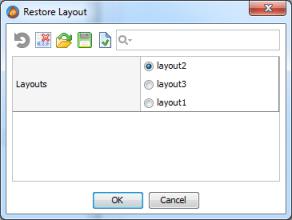
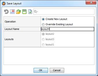
To save a layout, right-click the canvas and select "Save Layout". After this, select a layout to overwrite or select the "Create New Layout" operation and specify a new layout name. This functionality can be disabled by the Read Only Mode property.
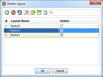
To delete a layout, right-click the canvas and select "Delete Layout". After this, choose the layouts to delete by selecting the check boxes across the layout names. This functionality can be disabled by the Read Only Mode property.
Basic Properties
Common
Graph has the following basic properties that are common for all widgets:
Visible, Background, Border, Font, Cursor, Pin Points, Popup Menu.
Topology Visualization
Graph inherits the following basic properties from Topology Visualization:
Preferred Action Name Expression, Vertex Popup Menu, Edge Popup Menu, Read Only Mode.
Mode
Graph mode: Transforming, Picking, or Editing. In the transforming mode, you can zoom, pan, rotate, and shear the graph. In the picking mode, you can move graph nodes individually. In the editing mode, you can create links between nodes.
It is possible to change the graph mode by using a binding. For example, you can add a mode selector Combo Box to a widget.
Property name: mode
Property type: Integer
Update Period
Graph update period. This period is used to re-read the topology information from the server and to refresh the graph.
Property name: updatePeriod
Property type: Long
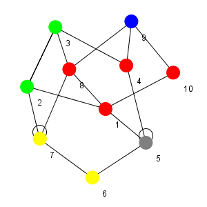
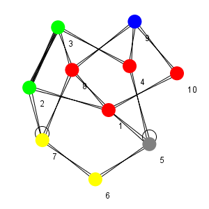
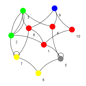
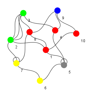
Edge Shape
Defines the visual look of graph edges. Possible choices are:
1. Line
| 2. Wedge
|
3. Quad Curve
| 4. Cubic Curve.
|
Property name: edgeShape
Property type: Integer
Size and Position Properties
Common
Graph has the following size and position properties that are common for all widgets:
Layout Constraints
Depending on the selected widget layout, graph uses either absolute layout constraints or grid layout constraints.
Bindings Properties
Graph uses Bindings property that is common for all widgets.
Topology Properties
Topology Visualization
Graph inherits the following properties from Topology Visualization:
Provider, Source and Target Nodes are Contexts, Display Unlinked Nodes, Topology Expression, Node Expression, Link Expression, Link Id Expression, Node Id Expression, Source Expression, Target Expression, Color Expression, Type Expression, Image Expression, Interface Expression, Directed Expression, Width Expression, Link Description Expression, Show Link Description, Link Color Expression, Show Neighbouring Nodes, Node Tooltip Expression, Link Tooltip Expression, Node Description Expression.
Vertex Mask
The mask of contexts. Topology data is obtained from these contexts. In most cases, each context that matches this mask will appear as a separate graph node.
Property name: vertexMask
Property type: String
Layout Properties
Topology Visualization
Graph inherits the following layout properties from Topology Visualization:
Azimuth Expression, Marker Ratio Expression.
Layout
Graph layout type. Supported layouts are:
- Kamada-Kawai
- Fruchterman-Reingold
- Circle
- Meyer's self-organizing
- Tree
- Balloon
- Radial
- Custom
Tree, Balloon, and Radial layouts ignore initial information of link direction. For these layouts, the direction of each link is set automatically by the layout algorithm.
Property name: layout
Property type: Integer
Attraction
Attraction factor for Fruchterman-Reingold layout.
Property name: attraction
Property type: Double
Repulsion
Repulsion factor for Fruchterman-Reingold layout.
Property name: repulsion
Property type: Double
Adjust for Gravity
Adjust for gravity flag, used by Kamada-Kawai layout.
Property name: adjustForGravity
Property type: Boolean
Disconnected Distance Multiplier
Disconnected distance multiplier for Kamada-Kawai layout.
Property name: disconnectedDistanceMultiplier
Property type: Double
Exchange Vertices
Exchange vertices flag for Kamada-Kawai layout.
Property name: exchangeVertices
Property type: Boolean
Length Factor
Length factor for Kamada-Kawai layout.
Property name: lengthFactor
Property type: Double
Horizontal Vertex Spacing
Defines horizontal distance between nodes.
Property name: horizontalVertexSpacing
Property type: Integer
Vertical Vertex Spacing
Defines vertical distance between nodes.
Property name: verticalVertexSpacing
Property type: Integer
Background Image
Background image that is displayed on the canvas.
Property name: backgroundImage
Property type: Data Block
Filter
Filter for nodes. Only nodes that have the specified string in their label will be highlighted on the graph.
Property name: filter
Property type: String
Revert Edges
Determines arrows direction for Tree, Balloon, and Radial layouts.
Property name: revertEdges
Property type: Boolean
Node X-Position Expression
An expression that returns X coordinate of a node within a Custom Layout.
Property name: customLayoutNodeXExpression
Property type: String
Node Y-Position Expression
An expression that returns Y coordinate of a node within a Custom Layout.
Property name: customLayoutNodeTExpression
Property type: String
Azimuth Expression
An expression used to define an orientation of node's image. It should return rotation angle in radians.
Property name: azimuthExpression
Property type: String
Marker Ratio Expression
An expression used to define a relative size of node's image. It should return values larger then 1 for scaling the image up and values less than 1 for scaling down.
Property name: ratioExpression
Property type: String
Image Custom Properties
This property allows to customize properties of CSS styles inherited into SVG images returned by Image Expression.
Each line in the Image Custom Properties Table allows to configure a single dynamic CSS property:
- CSS Class Name. Name of CSS class used in SVG node image.
- CSS Property. Name of CSS Class'es property that will be evaluated dynamically.
- CSS Property Value Expression. Expression that should return new property value as a string.
CSS Property Value Expression Resolution Environment: | |
Context corresponding to the graph node whose SVG image is being processed. | |
Result of Node Expression. | |
Currently processed row of the default table. | |
Standard variables only. | |
Custom Functions
Graph component provides the following custom functions:
Restore Layout
Switches the current graph layout to the specified layout preset. You can use this function to roll back the introduced layout changes or to load custom layouts.
Function name: restoreLayout
Field Name | Field Type | Field Description |
layoutName | String | Name of the layout preset. |
Save Layout
Saves the current graph layout as a layout preset with the specified name. You can use this function to create custom layouts.
Function name: saveLayout
Field Name | Field Type | Field Description |
layoutName | String | Name of the layout preset. |
Delete Layout
Deletes the specified graph layout preset. You can use this function to delete existing custom layouts.
Function name: deleteLayout
Field Name | Field Type | Field Description |
layoutName | String | Name of the layout preset. |
Get Layouts Names
Returns a list of existing layout presets.
Function name: getLayoutsNames
This function has no input parameters.
Output format:
Field Name | Field Type | Field Description |
layoutsName | String | Names of the existing layout presets. |
Get Layout
Returns graph layout as a table with two subtables: point locations and transformations. This table can be later used as an argument of Update Layout function.
Function name: getLayout
Field Name | Field Type | Field Description |
layoutName | String | Name of the layout preset. |
Update Layout
Updates graph layout with new layout parameters.
Function name: updateLayout
Field Name | Field Type | Field Description |
layoutName | String | Name of the layout preset. |
layoutData | Data Table | Layout data. Normally returned by Get Layout fuction. |
Common Events
Hidden, Shown, Moved, Resized, Mouse Clicked, Mouse Pressed, Mouse Released, Mouse Entered, Mouse Exited, Mouse Moved, Mouse Wheel Moved, Key Typed, Key Pressed, Key Released, Focus Gained, Focus Lost
Custom Events
nodeClick
This event is fired when you click a map node.
Event name: nodeClicked
Event fields:
Field | Name | Type | Description |
Node | node | String | Path of a clicked node/context. |
nodeHover
This event is fired when you hover the mouse pointer over a node.
Event name: nodeHover
Event fields:
Field | Name | Type | Description |
Node | node | String | Path of a hovered node/context. |
nodeUnhover
This event is fired when you hover the mouse pointer out of a node.
Event name: nodeUnhover
Event fields:
Field | Name | Type | Description |
Node | node | String | Path of a unhovered node/context. |
edgeClick
This event is fired when you click a link between two nodes.
Event name: edgeClicked
Event fields:
Field | Name | Type | Description |
Source | source | String | Edge source node/context. |
Destination | destination | String | Edge destination node/context. |
Source Interface | sourceInterfaceId | String | Edge source interface. This field is important when there are multiple edges between two nodes. |
Destination Interface | destinationInterfaceId | String | Edge destination interface. This field is important when there are multiple edges between two nodes. |
edgeHover
This event is fired when you hover the mouse pointer over a link between two nodes.
Event name: edgeHover
Event fields:
Field | Name | Type | Description |
Source | source | String | Edge source node/context. |
Destination | destination | String | Edge destination node/context. |
Source Interface | sourceInterfaceId | String | Edge source interface. This field is important when there are multiple edges between two nodes. |
Destination Interface | destinationInterfaceId | String | Edge destination interface. This field is important when there are multiple edges between two nodes. |
edgeUnhover
This event is fired when you hover the mouse pointer out from a link between two nodes.
Event name: edgeUnhover
Event fields:
Field | Name | Type | Description |
Source | source | String | Edge source node/context. |
Destination | destination | String | Edge destination node/context. |
Source Interface | sourceInterfaceId | String | Edge source interface. This field is important when there are multiple edges between two nodes. |
Destination Interface | destinationInterfaceId | String | Edge destination interface. This field is important when there are multiple edges between two nodes. |
edgeCreate
This event is fired when you drag the mouse pointer from one node to another in the edit mode.
Event name: edgeCreate
Event fields:
Field | Name | Type | Description |
Source | source | String | Edge source node/context. |
Destination | destination | String | Edge destination node/context. |
Source Interface | sourceInterfaceId | String | Edge source interface. This field is important when there are multiple edges between two nodes. |
Destination Interface | destinationInterfaceId | String | Edge destination interface. This field is important when there are multiple edges between two nodes. |
edgeDelete
This special event with additional functions is generated when the deleteEdge popup menu is created.
Event name: edgeDelete
Event fields:
Field | Name | Type | Description |
Source | source | String | Edge source node/context. |
Destination | destination | String | Edge destination node/context. |
Source Interface | sourceInterfaceId | String | Edge source interface. This field is important when there are multiple edges between two nodes. |
Destination Interface | destinationInterfaceId | String | Edge destination interface. This field is important when there are multiple edges between two nodes. |
nodeShowPopup
This event is fired when you right-click a node to display a popup menu.
Event name: nodeShowPopup
Event fields:
Field | Name | Type | Description |
Node | node | String | Path of a node/context. The popup menu is displayed for this node. |
edgeShowPopup
This event is fired when you right-click a link between two nodes to display a popup menu.
Event name: edgeShowPopup
Event fields:
Field | Name | Type | Description |
Source | source | String | Edge source node/context. |
Destination | destination | String | Edge destination node/context. |
Source Interface | sourceInterfaceId | String | Edge source interface. This field is important when there are multiple edges between two nodes. |
Destination Interface | destinationInterfaceId | String | Edge destination interface. This field is important when there are multiple edges between two nodes. |
graphShowPopup
This event is fired when you right-click the graph canvas to display a popup menu.
Event name: graphShowPopup
This event has no fields.
Was this page helpful?

