LED Display
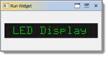
This component displays a string or number by emulating a bar or LED indicators. |
|
This is what a LED display looks like:

Common Properties
Width, Height, Bindings, Visible, Foreground, Background, Border, Cursor, Tooltip, Popup Menu
Custom Properties
Text
Text displayed by LED component. Note that not all symbols are supported. Unsupported symbols are displayed as question marks.
Property name: text
Property type: String
Horizontal Alignment
Horizontal alignment of text inside the LED display: Center, Left or Right.
Property name: horizontalAlignment
Property type: Integer
Vertical Alignment
Vertical alignment of text inside the LED display: Center, Top or Bottom.
Property name: verticalAlignment
Property type: Integer
Dot Off Color
Color of disabled LCD dots.
Property name: dotOffColor
Property type: Color
Dot Width
Width of a single dot.
Property name: dotWidth
Property type: Integer
Dot Height
Height of a single dot.
Property name: dotHeight
Property type: Integer
Horizontal Gap
Horizontal gap between dots.
Property name: horizontalGap
Property type: Integer
Vertical Gap
Vertical gap between dots.
Property name: verticalGap
Property type: Integer
Padding
Number of dots that will never lit at the left, right, top and bottom sides of display.
Property name: padding
Property type: Data Table
Common Events
Hidden, Shown, Moved, Resized, Mouse Clicked, Mouse Pressed, Mouse Released, Mouse Entered, Mouse Exited, Mouse Moved, Mouse Wheel Moved, Key Typed, Key Pressed, Key Released, Focus Gained, Focus Lost
Was this page helpful?
