Bar Chart
A category bar chart represents data items as rectangular bars. |
|

The bar chart is based on Category Plot and Category Bar Renderer. It inherits all their properties.
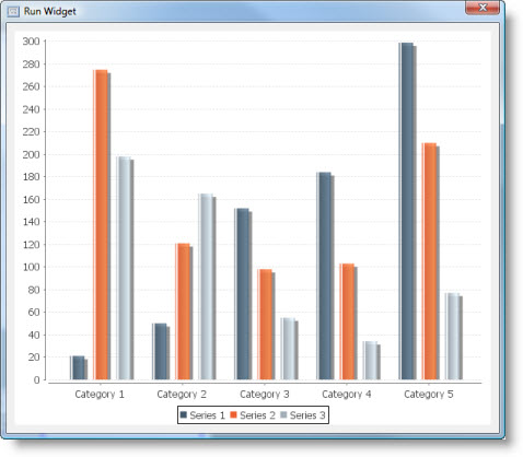
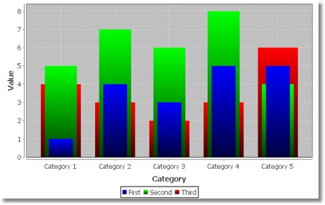
This is what category bar chart looks like:
Category bar chart supports six renderers.
Bar Renderer
A classic bar renderer that draws bars for every series/category pair as a separate "bar group".
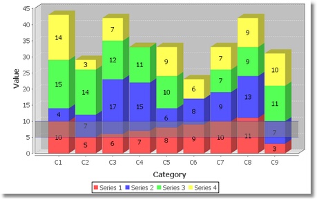
Stacked Renderer
A renderer that "stacks" bars from different series in every category.
Bar 3D Renderer
A renderer that draws items using bars with a 3D effect.
Stacked 3D Renderer
A renderer that draws stacked bars with a 3D effect.
Layered Bar Renderer
A renderer that draws bars for every series/category pair one over another.
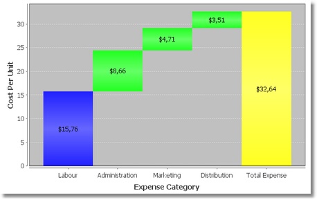
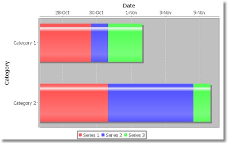
Waterfall Bar Renderer
A renderer for drawing "waterfall" charts. A waterfall chart highlights the difference between two values and the components that make up that difference.
 | The value in the last category of the dataset should be (redundantly) specified as the sum of the items in the preceding categories - otherwise the final bar in the plot will be incorrectly plotted. |
| Bar colors for this renderer are defined using special properties. Related properties inherited from the base renderer are ignored. |
Dataset
The category bar chart supports Custom Data model only.
It has the following Source Data Bindings:
Binding | Expected Value Type | Description |
Series | String | Textual name of the data series. |
Category | String | Name of category. Categories are displayed along the domain axis. |
Value | Number | Numeric value to display for the above series/category. Values are displayed along the range axis. |
Common Properties
Width, Height, Bindings, Visible, Opaque, Background, Border
Source Data and Source Data Bindings properties.
All properties of a Category Plot.
All properties of a Category Bar Renderer.
Custom Properties
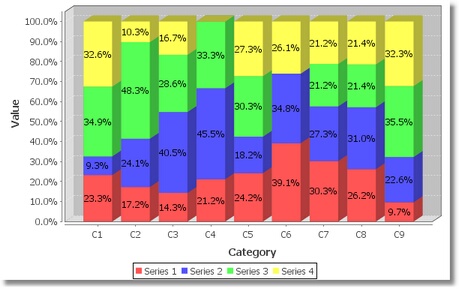
Render as Percentages
Flag that controls whether the renderer displays each item value as a percentage (so that the stacked bars add to 100%).
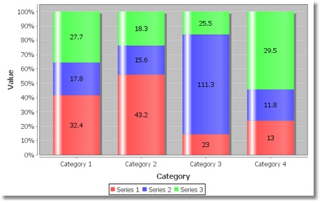
Example of a stacked bar chart that displays values as percentages:
This property is valid for Stacked Renderer and Stacked 3D Renderer.
Property name: renderAsPercentages
Property type: Boolean
X Offset
X-offset for the 3D effect.
This property is valid for Bar 3D Renderer and Stacked 3D Renderer.
Property name: XOffset
Property type: Float
Y Offset
Y-offset for the 3D effect.
This property is valid for Bar 3D Renderer and Stacked 3D Renderer.
Property name: YOffset
Property type: Float
Wall Paint
Paint used to color the "sides" (or "walls") of the plot background area.
This property is valid for Bar 3D Renderer and Stacked 3D Renderer.
Property name: wallPaint
Property type: Data Table
First Bar Paint
Paint used for the first bar (i.e. first category).
Property name: firstBarPaint
Property type: Data Table
Last Bar Paint
Paint used for the last bar (i.e. last category).
Property name: lastBarPaint
Property type: Data Table
Positive Bar Paint
Paint used for the intermediate bars representing positive values.
Property name: positiveBarPaint
Property type: Data Table
Negative Bar Paint
Paint used for the intermediate bars representing negative values.
Property name: negativeBarPaint
Property type: Data Table
Common Events
Hidden, Shown, Moved, Resized, Mouse Clicked, Mouse Pressed, Mouse Released, Mouse Entered, Mouse Exited, Mouse Moved, Mouse Wheel Moved, Key Typed, Key Pressed, Key Released, Focus Gained, Focus Lost
All relevant chart events.
Additional Examples
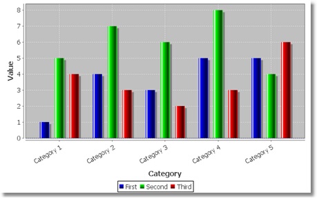
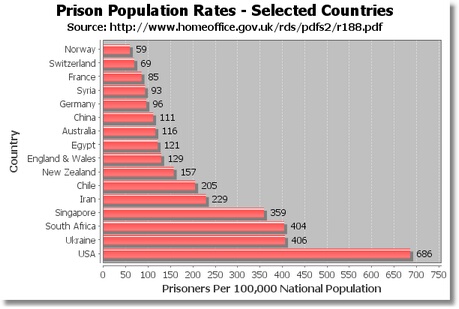
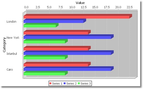
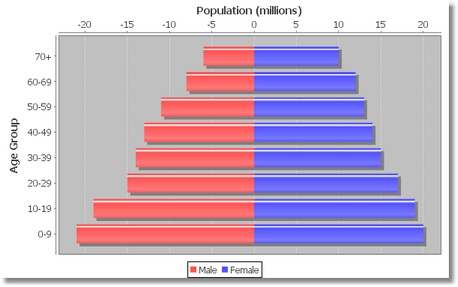
Horizontally-oriented bar chart:
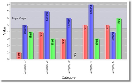
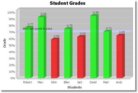
A bar chart with the customized Default Item Label Position. A range marker has been added to the chart to indicate a target range for the data values:
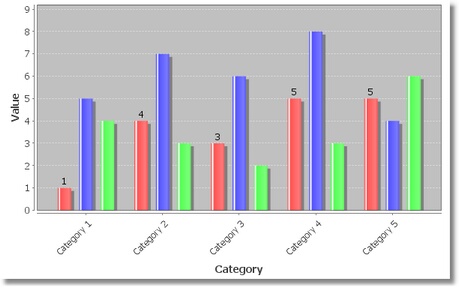
A bar chart with items labels displayed for just one series:
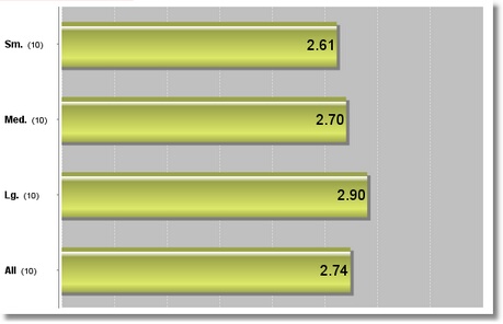
Another labels customization:
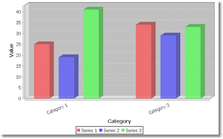
A 3D bar chart with multiple series:
A 3D bar chart with horizontal orientation:
A bar chart with customized Series Paints:
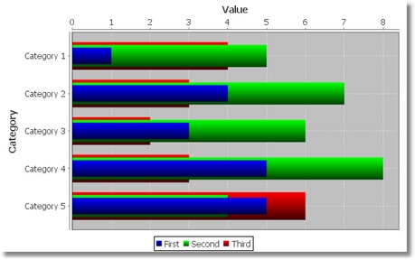
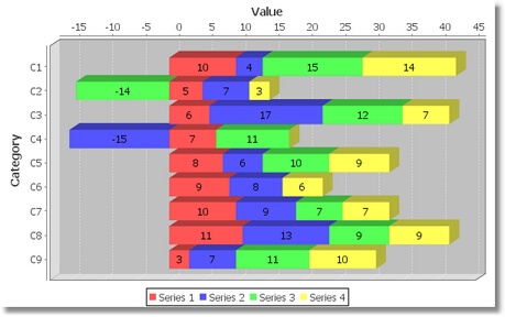
A layered bar chart with horizontal orientation:
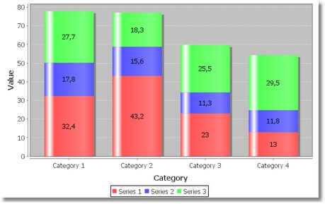
Stacked bar chart with negative values:
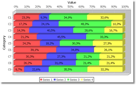
A stacked bar chart with a horizontal orientation and Render As Percentages enabled. A completely transparent color is used for the middle series, so that it leaves a gap in the chart:
![]()
A stacked bar chart that uses a Date Axis for the range axis:
A stacked bar chart with 3D effect and interval marker:
A stacked bar chart with 3D effect and vertical orientation:
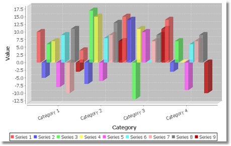
A stacked bar chart with 3D effect and negative values:
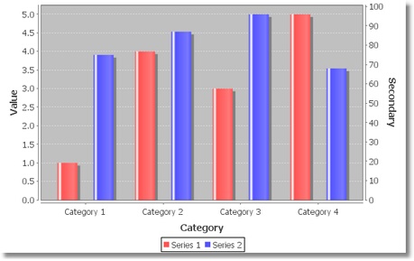
A bar chart with two range axes:
Was this page helpful?