Grid Layout
This layout is a grid of rows and columns, allowing certain components to span multiple rows or columns. Rows can have different heights. Similarly, columns may have different widths. This grid may be toggled (shown or hidden) when editing the widget template in Widget editor, but it is never shown when the widget is running. Only the actual components are visible.
 | Don't mix grid layout with absolute layout's snapping grid. |
Here is an example widget with five Button components in its root panel:
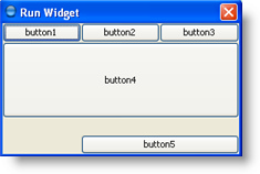
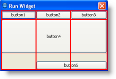
The layout grid for this widget has three rows and three columns. The button in the second row spans all columns, and the button in the third row spans the two right columns:
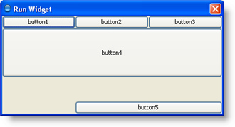
If you enlarge the widget window as shown in the following figure, you will notice that the bottom row, which contains Button 5, gets all the new vertical space. The new horizontal space is evenly split between all columns. This resizing behavior is based on weights assigned to individual components in the panel layout. You will also notice that each component takes up all available horizontal space — but not (as you can see with button 5) all available vertical space. This behavior is also specified by component weights.
Grid Layout Constraints
Constraints that characterize the position of components in a grid layout are:
Row, Column
Specify the row and column of the top-left part of the component. The leftmost column is column 0 and the top row is row 0.
Property names: gridx, gridy
Row Span, Column Span
Specify the number of columns or rows occupied by the component in the layout grid of its parent container. These constraints specify the number of cells the component occupies, not the number of pixels or any other unit. The default value is 1.
Property names: gridWidth, gridHeight
Anchor
Used when the component is smaller than its display area to determine where (within the area) to place the component. Valid values are:
- Center
- North
- East
- South
- West
- North-West
- North-East
- South-East
- South-West
So if you have a big area and a small component, the Anchor position lets you determine where the component sits within the abundance of space it has available to it.
Property name: anchor
Fill
Used when the component's display area is larger than the component's requested size to determine whether and how to resize the component. Valid values include None (the default), Horizontal (make the component wide enough to fill its display area horizontally, but leave its height as-is), Vertical (make the component tall enough to fill its display area vertically, but leave its width as-is), and Both (make the component completely fill its display area).
Property name: fill
Top Margin, Bottom Margin, Left Margin, Right Margin
Specifies the external padding of the component -- the minimum amount of space between the component and the edges of its display area. The display area is the amount of space the current layout provides for the component. By default, each component has no external padding (i.e. all margins are set to zero).
Property names: insetsTop, insetsBottom, insetsLeft, insetsRight
Weight X, Weight Y
Specifying weights can have a significant impact on the appearance of the components in the layout grid. Weights are used to determine how to distribute space among columns (Weight X) and among rows (Weight Y); this is important for specifying resizing behavior. For each column, the weight is related to the highest Weight X specified for a component within that column (the same goes for each row's weight and the highest Weight Y for a component within that row).
Unless you specify at least one non-zero value for Weight X or Weight Y, all components clump together in the center of their container. This is because when the weight is 0.0 (the default), any extra space is put between the grid of cells and the edges of the container.
Usually, weights are specified with 0.0 and 1.0 as the extremes. Larger numbers within this range indicate that the component's row or column should get more space. Extra space tends to go toward the rightmost column and bottom row.
Here is how components look like if their weights are 1.0:
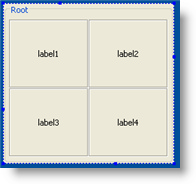
Setting weights of the same components to 0.0 produces the following result:
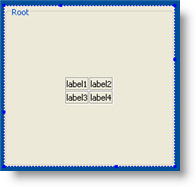
Property names: weightx, weighty
Constraints Example
Let's return to our example widget with five buttons:

Here are constraints for these buttons (only non-default values are shown here):
Button 1:
Row: 0
Column: 0
Weight X: 1.0
Fill: Horizontal
Button 2:
Row: 0
Column: 1
Weight X: 1.0
Fill: Horizontal
Button 3:
Row: 0
Column: 2
Weight X: 1.0
Fill: Horizontal
Button 4:
Row: 1
Column: 0
Column Span: 3
Weight X: 1.0
Fill: Horizontal
Button 5:
Row: 2
Column: 1
Column Span: 2
Anchor: Center
Top Margin: 20
Weight X: 1.0
Weight Y: 1.0
Fill: Horizontal
To find out how to build the actual layout, see the editing widget layout section in the description of Widget editor.
Was this page helpful?