Monitoring Device Parameters Using a Chart
Charts are very good for displaying changes in device parameters. In this tutorial we'll show you how to chart sample data. Connecting a sensor to the server is beyond the scope of this article, so we will use a Virtual Device with some sample data.
Dashboard Creation
We will be using a dashboard created during the Building a Device Status Report tutorial. You can create a new dashboard by right-clicking on the Dashboards node in the System Tree and selecting Create.
Adding Chart Component
Drag the Line Chart component from the component palette and drop it into the Dashboard. Our example uses the Grid layout, but any layout can be used.
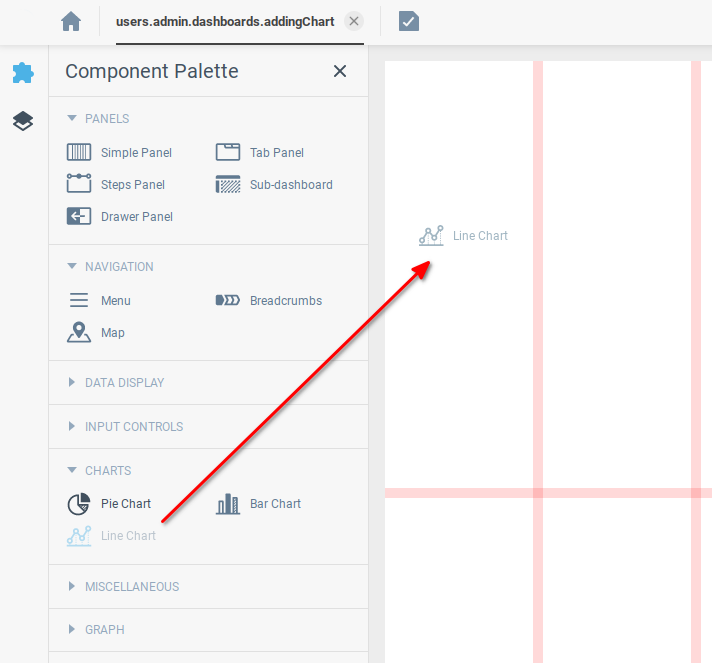
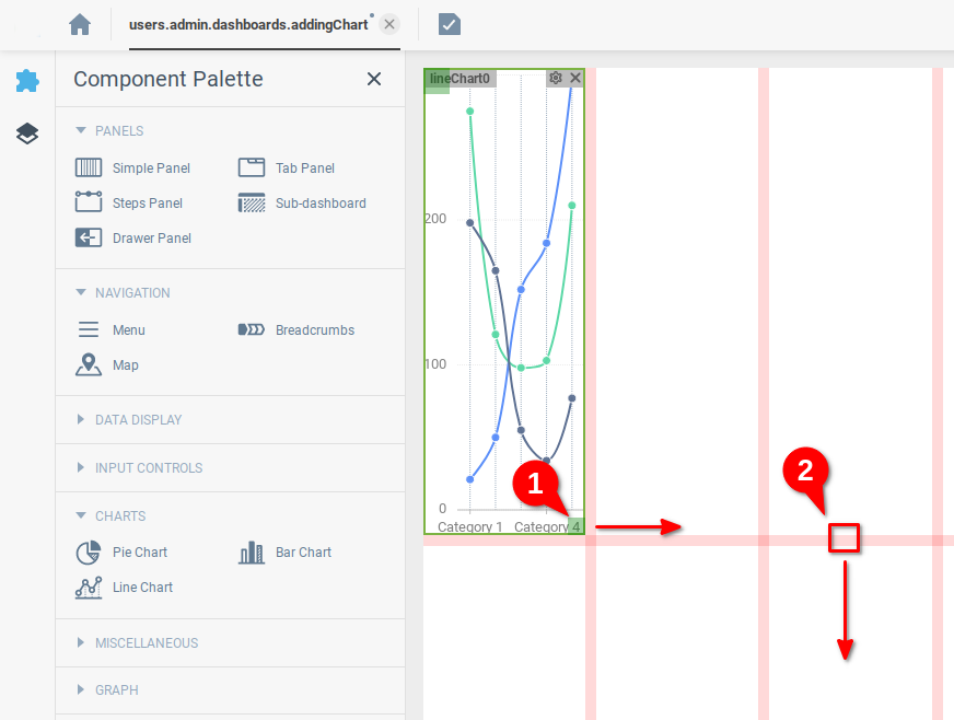
We drag the bottom-right corner of the component (1) to change the number of grid cells it occupies, and drag the horizontal grid line (2) to change the scale of the grid lines to our liking.
Setting up a Sample Data Source
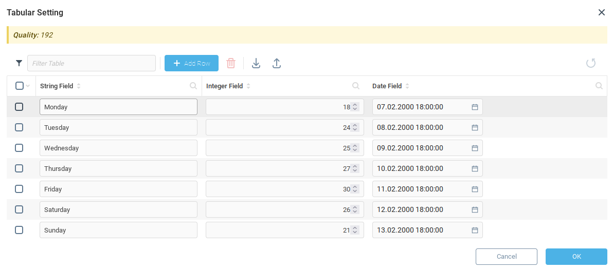
Our chart will show changes in the value of context variables. Our Virtual Device has a variable labeled Tabular Setting under the tab Settings of Different Types. We will use this to hold some example data. As you can see below, we’ve added something like a daily temperature reading to the variable Tabular Settings.
Importing Data Into Chart
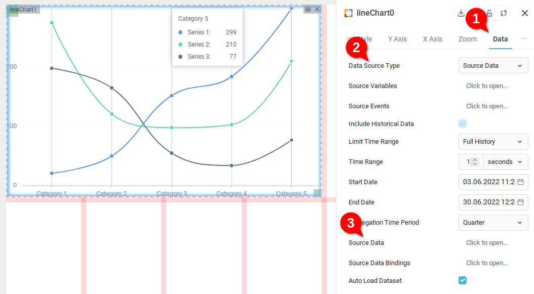
There are a few methods exposing data to a line chart. Under the Data tab (1) of our Line Chart, we select Source Data for Data Source Type (2). This will extract data from the Source Data variable (3) of the chart. We see that example data is displayed when Source Data is set for Data Source Type.
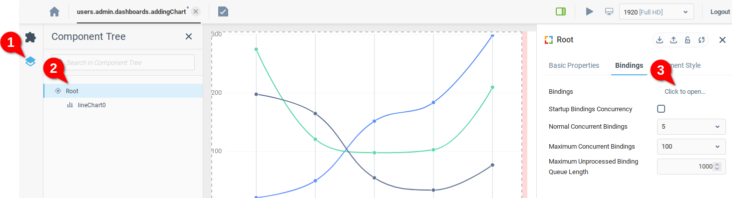
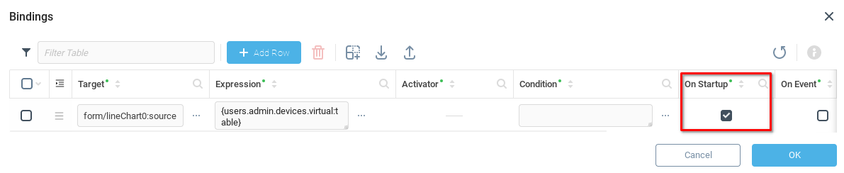
We open the Component Tree tab (1) and open the Root panel (2) properties, finally opening the Bindings table (3).
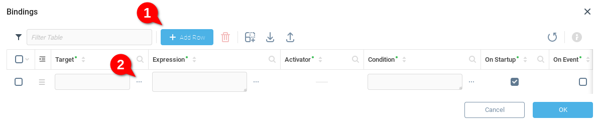
We will create a rule in the Bindings table which will allow the chart to access data in our Virtual Device. We Add Row (1) and then open the Target field (2) to choose the destination for our data.
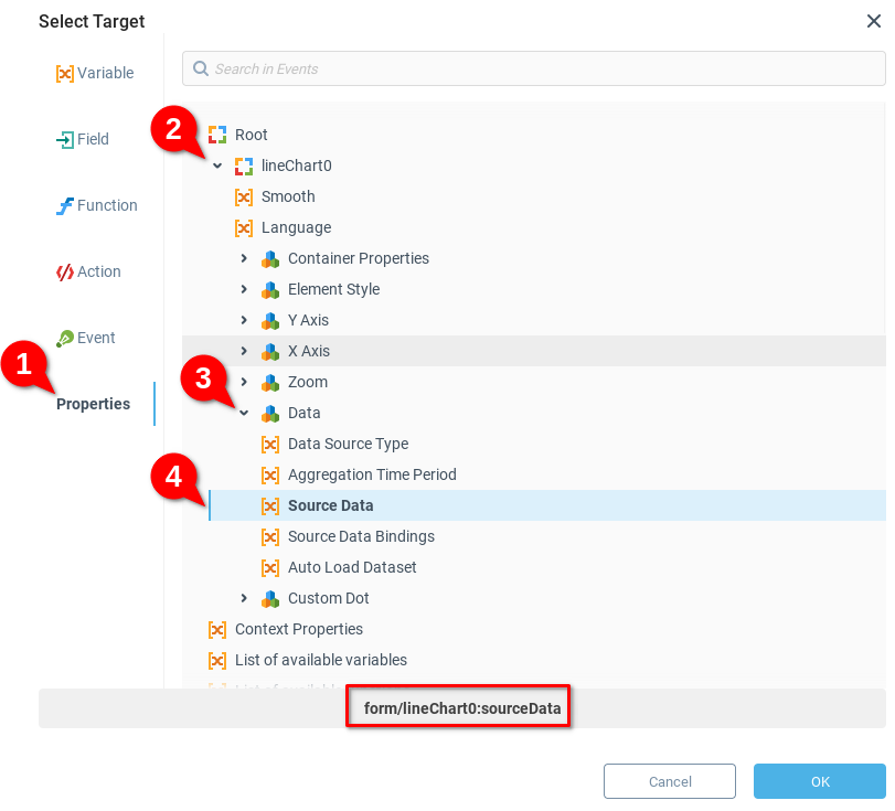
From the Select Target dialogue, we select Properties (1), expand the lineChart0 node (2), expand the Data node (3) and finally choose Source Data (4). Note that the exact context path is displayed at the bottom. We click OK to save.
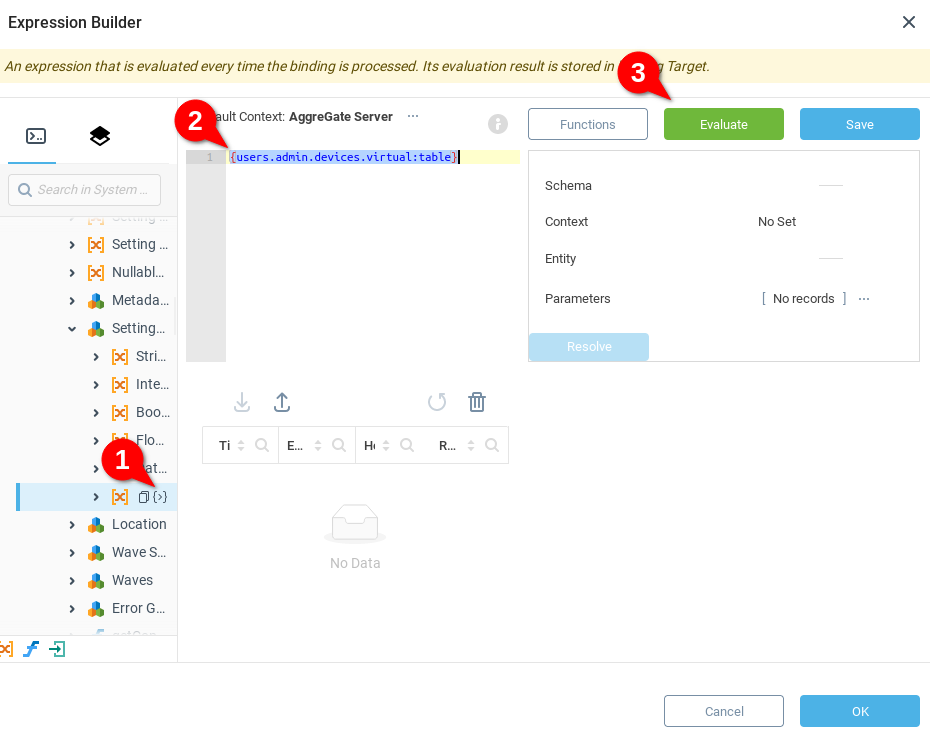
Next we open the Expression builder and navigate to Devices>Virtual Device>Settings of different Types>Tabular Setting variable in the system tree (1) and insert the absolute context path by clicking the {>} icon. We see that {users.admin.devices.virtual:table} is inserted into the expression (2). We can check that the correct values are being retrieved by clicking on the Evaluate button (3).
Our Binding is complete once we check the On Startup field, to ensure that binding runs when the dashboard is loaded.
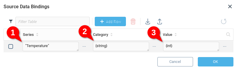
We click OK and save our bindings. We navigate back to the Data tab (1) of the Line Chart properties, and open Source Data Bindings (2). We see that the Series, Category, and Value fields are filled with the default values. We will use the following values
We only need one line on our chart, so we will set the Series to the same value for all rows in our temperature table:
“Temperature"Recalling that our example data has the day of the week saved in the “string” column, we set the value of the Category field to
{string}We want to visualize the temperature values, so in the Values field we set to
{int}, recalling that the example temperatures are saved in a column named “int”.
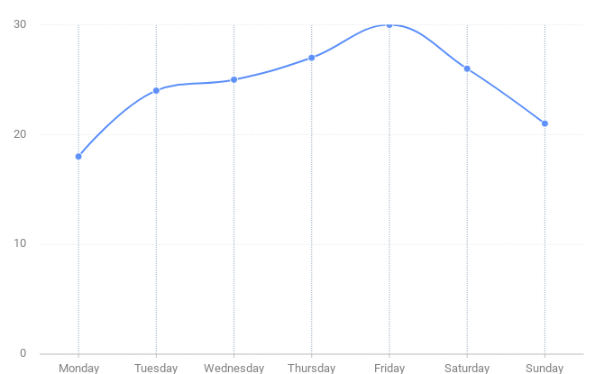
We save and launch our dashboard, and see our chart appearance.
Configuring Chart Properties
At this point you may want to configure your chart. See the Chart article for more information about available properties and their descriptions. For example, you may want to change Include Historical Data and Include Real-Time Data flags to get chart based on current temperature, temperature history or both. Another option to change is Type of Domain Axis. Setting it to Date Axis or Period Axis makes horizontal axis to display dates instead of integer numbers. Yet another useful option is Renderer that affects chart's appearance.
You can also limit chart's time range by enabling the Limit Time Range option and changing Time Range to a preferred value.
Was this page helpful?