Containers with Dynamic Content
The Dynamic Container properties common to all containers allow you to automatically generate, modify, and control component layouts and content within a container.
At the fundamental level, a container with dynamic content is a container and a replicated component tree. The replicated component tree can be a single component or the root of a component tree with a complex hierarchy of children components. In any case, a component replica is created for every row of the Dynamic Contents data table in the parent container. With the help of bindings targeting the component properties, each replicated component tree can be configured based on the data contained in the Dynamic Contents data table.
Some possible use cases for dynamic containers are:
Flexible UI for different types of data: Create and display dynamic UI components based on diverse datasets without needing to create UIs for each data format.
Dynamic forms: Generate and manage forms with fields that change based on user input or data from external sources, ensuring a personalized and adaptive user experience.
Dynamic listings: Create a dynamic listing page that updates based on the current inventory, user preferences, or any other factor.
In the (likely) case where the replicated component tree contains bindings specific to components within the component tree, the bindings will be appropriately replicated for every nested replicated container.
 | Containers with dynamic content cannot be nested in containers with dynamic content. Doing so will result in an error at dashboard runtime. |
Fundamental Example
The following example illustrates how to use the core concepts of dynamic containers, by creating a dashboard with a dynamic container and configuring the appropriate bindings
Create a Dashboard with a Simple Panel container
Creating and modifying dashboards is covered in the tutorial Building a Device Status Report. You can create a new dashboard by right-clicking on the Dashboards node in the System Tree and selecting Create.
Add a Simple Panel container to the dashboard.

Add a Label component to the panel component.

Now that the components needed for dynamic content have been created, further configuration will concern component properties and bindings.
Configure Dynamic Content in the Panel Container Using Bindings
From the component tree, click on the panel0 component to open the component properties editor.

Open the Dynamic Contents tab, enable the property Enable Dynamic Contents, and open the binding page for the Dynamic Contents table.

Note that an icon appears near the label component in the Component Tree, indicating that it will be replicated as a result of Dynamic Contents being enabled

To replicate the label component, there must be a data table in the Dynamic Content variable. For every row in the table, a label component will be created in the panel container. Configure the bindings for the Dynamic Contents with the following data:
Field | Value |
|---|---|
Target |
|
Expression | table("<<text><S><D=Text><F=N><M=1>>","First","Second","Third") |
On Startup | True |
On Event | False |

Click OK to save the binding. When the component loads, the Dynamic Content property will be populated with the data table:
Text |
|---|
First |
Second |
Third |
Configure Dynamic Content in the Panel Container via Properties Editor
Alternatively, you can define the Dynamic Content data directly through the properties editor instead of using bindings.
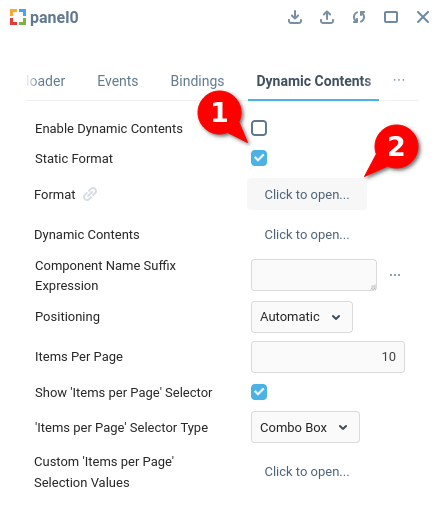
First, enable the property Static Format (1) to indicate that you are going to define the Dynamic Contents format through the properties editor. Then open the Format (2) property.
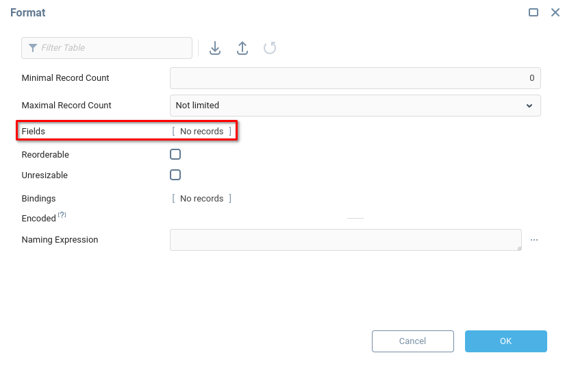
From the Format menu, open the Fields property:
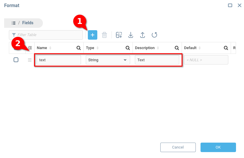
Define a single field with Name text, Type String, and Description Text. Add a row (1), then fill in the appropriate fields (2):
Click OK to save. Now that a format has been defined for the Dynamic Contents property, you can add data manually via the properties editor. Open the Dynamic Contents property.
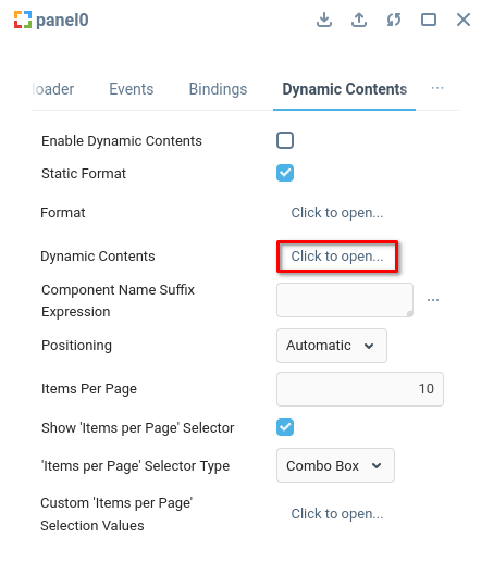
The Dynamic Contents property is now defined as a data table with a single field Text. For this example, add three rows with values First, Second, and Third.
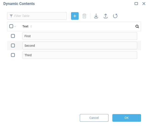
The Dynamic Content property is now populated with the following data table:
Text |
|---|
First |
Second |
Third |
Change Label Text with Bindings
In order to utilize the data from the data table Dynamic Content, bindings for the label component must be configured.
A label component will be created for each row in the Dynamic Content data table. The example data table has the field name text. The following section shows how to reference values from this data table to control the value of the Text property. In order to reference the value in the current row from an expression, the standard references are used. In this case, the name of the desired field is enclosed in curly brackets,
Open the Properties Editor of the label component, and open the bindings for the Text property.

Configure the bindings with the data indicated in the following table.
Field | Value |
|---|---|
Target |
|
Expression |
|
On Startup | True |
On Event | True |
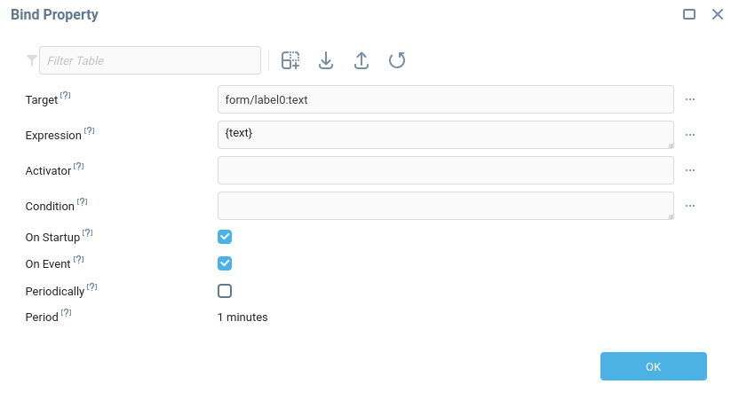
The expression will evaluate to “First” for the first row of the Dynamic Content data table, “Second” for the second row, and so on. The result of the expression will be saved to the Text property. Click OK to save the binding.
To visually differentiate the dynamically created components, add some styling to the Container Style, for example black borders and slightly larger, centered text:
{
  border-style: solid;
  border-color: black;
  font-size: 2em;
  text-align: center;
}Preview the Dashboard to Ensure Dynamic Content is Rendered
To preview the dashboard, click the preview button:

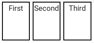
And see that multiple label components have been dynamically rendered, based on the data from the Dynamic Contents data table:
Editing Dynamic Container Data Table during Runtime
The Dynamic Contents data table can be modified during dashboard runtime with bindings. The following example considers the case of the user pressing a button component to trigger an update to the Dynamic Contents table.
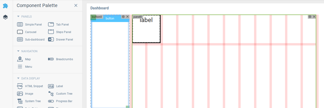
Add a Button component to the Root of the dashboard, next to the panel component. Note that the button is not inside the panel container.
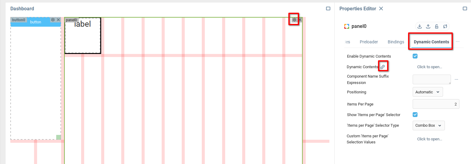
Open the bindings table of the Dynamic Contents panel component, by navigating to the Panel Properties Editor > Dynamic Contents tab > Dynamic Contents bindings icon.
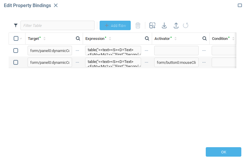
Add another row to the bindings table, with a slightly modified expression. The expression evaluates to a data table with an additional row with value “Button Clicked”.
The Activator field indicates that this binding should fire only when the specified event occurs, and below is specified a Mouse Clicked event of the button component.
Field | Value |
|---|---|
Target |
|
Expression | table("<<text><S><D=Text><F=N><M=1>>","First","Second","Third", "Button Clicked") |
Activator |
|
On Startup | False |
On Event | True |
Click OK to save the binding.
Open the bindings table for the Text property of the label component, found in the label component’s Properties Editor.

Modify the binding by adding the Dynamic Contents Refreshed event as an activator, which will ensure that the binding is evaluated again every time the Dynamic Contents table changes.
Field | Value |
|---|---|
Target |
|
Expression |
|
Activator |
|
On Startup | False |
On Event | True |

Click OK to save the binding.
Open the dashboard preview, and see the newly created button component, with three dynamically created label components:

After clicking the button component, a fourth label component is created:

Pagination
The properties Items per Page, Show 'Items per Page’ Selector, 'Items per Page’ Selector Type, and Custom ‘Items per Page’ Selection Values all allow you to control the number of dynamic components displayed to the user per “page” of the container.
This can be useful when the size of the container with the dynamic content will be too small to display all the expected dynamic components.
To see how this works, set the following values in the panel Properties Editor:
Property | Value |
|---|---|
Items per Page |
|
Show 'Items per Page’ Selector |
|
'Items per Page’ Selector Type |
|
Custom ‘Items per Page’ Selection Values | Leave as default. |
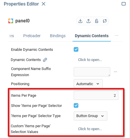
Preview the dashboard to see that pagination tools and selectors have appeared at the bottom of the container:

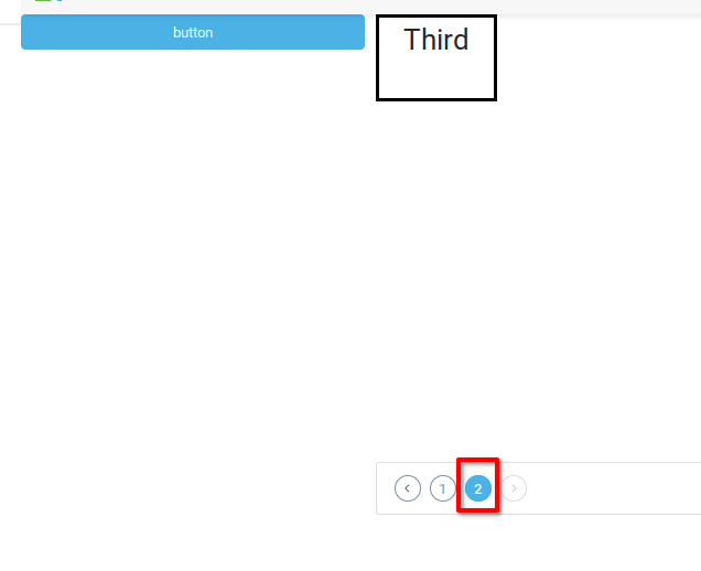
By using the pagination tools, the second page of components can be displayed:
Custom div id of Component
By default, the id of the html label1, label2, label3, and so on. There may be a need to create custom div ids for the dynamically created components. In this case, the Component Name Suffix Expression can be used to offer more control over the value appended to the div ids.
Set the property of Component Name Suffix Expression to "_clone_"+{#row} + {text} to add additional text to the div id. Using the HTML inspector of the browser, the customized div ids can be seen:

Manual Positioning
In order to “manually” control the positioning of components in the dynamic container, apply bindings to the Column and Row properties of the label component, and specify custom values drawn from the Dynamic Content table, or elsewhere.
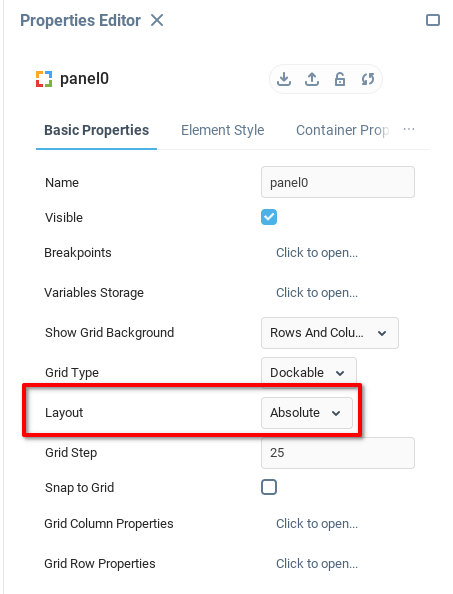
For illustration, set the Layout property of the panel component to Absolute.
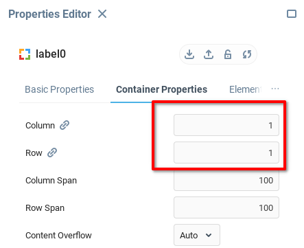
Under Container Properties of the label component, set the Column and Row properties to 1, to ensure that the component is in the upper left corner of the container.
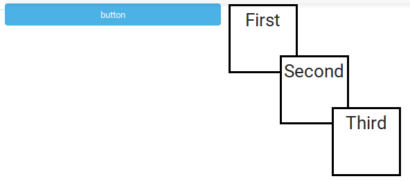
Open the bindings table for the Column and Row properties, and add a bindings row to each with the values indicated in the table. The expression {#row}*75 takes the {#row} value, which is the number of the row currently being evaluated, and multiplies it by 75. The first component will be placed at (0,0), the next row at (75,75), and the third at (150,150), giving a cascading effect.
Field | Value |
|---|---|
Target |
|
Expression |
|
Activator |
|
On Startup | True |
On Event | True |

Click OK to save the binding. Open the dashboard preview to see the custom layout of the components.
Behavior of Steps Panel, Tabbed Panel, and Carousel
Tabbed Panel, Steps Panel, and Carousel components can all be set as dynamic containers. In this case, the sub element created (Tab, Step, or Panel, respectively) is what will be generated dynamically.
For example, a Tabbed Panel with dynamic contents enabled will create a new Tab for each row of the Dynamic Contents table.
Was this page helpful?